Municipal waste teams collect enormous amounts of data every day. Every checkpoint, every completed stop, every missed one. The problem is turning that data into something a city official can actually use.
A spreadsheet full of checkpoint statuses doesn’t tell a quick story. Someone has to dig through rows and columns to figure out which wards are falling behind, and by the time they notice, the gap has usually already caused a complaint or two.
Uffizio has been working on this exact problem inside Smart Waste, its municipal waste management platform. One of the tools built to close this gap is the checkpoint coverage heatmap.
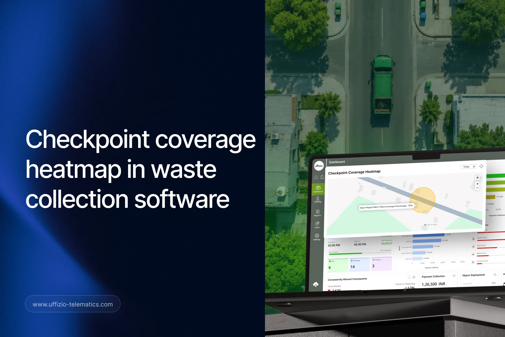
Uffizio Smart Waste’s checkpoint heatmap colors each ward from dark red to dark green based on how much of its waste collection is complete, from 0% to 100%. It turns raw checkpoint data into a picture anyone can read in seconds.
For system integrators and resellers working with municipal or city-contracted clients, this is the kind of feature that makes Smart Waste easy to demo and easy to sell, because the value is visible immediately.
The Problem With Raw Checkpoint Data
Waste collection software generates a lot of checkpoint data: which stops were completed, which were missed, and when. On its own, this data is accurate but hard to act on quickly.
A city running dozens or hundreds of wards can’t expect a supervisor to manually review a report for each one, every single day. By the time someone spots a pattern of missed checkpoints in a report, residents in that ward may have already complained, or worse, stopped trusting the service.
This is a common problem across municipal software in general, not just waste management. Data exists, but it isn’t presented in a way that supports fast decisions. The checkpoint heatmap is Uffizio’s answer to that problem, specifically for waste collection.
How the Uffizio Smart Waste Heatmap Works
The heatmap takes checkpoint completion data and maps it visually across a city, ward by ward. Each ward is shaded based on its collection percentage for a given period.
A ward at or near 100% completion shows in dark green. A ward with poor coverage, closer to 0%, shows in dark red. Wards in between fall somewhere along that same red-to-green scale, so a supervisor can immediately spot which areas need attention without opening a single detailed report.
This view updates as checkpoint data comes in, so it reflects current collection performance rather than a static snapshot from days ago. A city manager can open the dashboard in the morning and know, at a glance, which wards had a rough day yesterday.
The heatmap also works alongside other Smart Waste tools, including a dedicated widget that lists checkpoints that have been consistently missed, broken down by how overdue they are. Together, these give a fuller picture: the heatmap shows where the problem is, and the missed-checkpoints widget shows how serious it’s become.
Why Visual Data Changes How Teams Respond
There’s a real difference between knowing a problem exists and seeing it clearly enough to act on it fast. A table of numbers requires someone to interpret it. A color-coded map doesn’t.
This matters most for people who aren’t reviewing data all day. A city official checking in on service performance once a week doesn’t need to become an expert in checkpoint reporting. They need to look at a map and instantly understand where things stand.
It also helps with prioritization. When several wards are underperforming, color intensity makes it obvious which ones need attention first. A ward that’s deep red is a bigger concern than one that’s a lighter shade, even if both are technically behind schedule.
This kind of visual clarity also helps during internal reviews or client meetings. A heatmap is far easier to present and discuss than a spreadsheet, especially when the audience includes non-technical stakeholders like city council members or department heads.
How This Fits With Other Smart Waste Reporting
The heatmap isn’t the only reporting tool inside Smart Waste, but it’s often the one that ties the others together. A supervisor might start their day by scanning the heatmap, then drill into a specific ward’s checkpoint report if something looks off.
From there, they can check whether missed checkpoints in that ward are tied to a specific collector, a vehicle issue, or a recurring route problem. Smart Waste’s other widgets, like collection pattern analysis by weekday or the top problem areas widget, help fill in that context.
This layered approach means the heatmap doesn’t have to carry the full weight of every decision on its own. It’s the starting point that tells a team where to look next, and the rest of the reporting suite answers the follow-up questions.
For clients who already use spreadsheets or basic dashboards to track collection performance, this layered view is often the biggest single improvement Smart Waste offers. It’s not just more data. It’s the same data, organized so the right person can find the right answer faster.
What This Means for City Planning
Beyond day-to-day operations, the heatmap has a role in longer-term planning. Patterns that show up repeatedly, like a particular ward consistently lagging behind others, point to something structural rather than a one-off issue.
That could mean a route needs to be redesigned, a collection crew needs more support, or a ward’s checkpoint schedule doesn’t match its actual waste volume. None of these are obvious from a single day’s data, but they become clear when a city can look at coverage trends over weeks or months.
This turns the heatmap from a monitoring tool into a planning tool. City officials responsible for budgets, staffing, and route design get a data-backed starting point for those decisions, instead of relying on anecdotal complaints or guesswork.
What This Means for Integrators and Resellers
For system integrators, the heatmap is part of the existing Smart Waste dashboard, so there’s no separate system or integration needed. Once checkpoint data is flowing into Smart Waste, the heatmap builds itself from that same data.
This makes it an easy feature to show during onboarding. New users of Smart Waste don’t need training to understand what red and green mean on a map. It’s intuitive from the first login.
For resellers, this is a strong selling point in conversations with municipal clients, especially those who are used to reviewing lengthy reports rather than visual dashboards. Being able to show, rather than describe, how coverage gaps show up in real time is often more persuasive than any feature list.
It’s also a useful entry point into a broader conversation about Smart Waste’s other reporting tools, like the missed-checkpoints widget, complaint SLAs, and revenue tracking by ward. A client who’s impressed by the heatmap is usually receptive to hearing about what else the platform can show them.

Frequently Asked Questions
What data does the checkpoint heatmap use?
It uses checkpoint completion data collected during waste collection jobs, calculated as a percentage for each ward over a selected period.
How often does the heatmap update?
It reflects current checkpoint data as it comes in, so it shows recent collection performance rather than a fixed, outdated snapshot.
Does the heatmap replace detailed checkpoint reports?
No. It works alongside detailed reports and widgets, like the consistently missed checkpoints widget, giving a quick overview first and detailed data when needed.
Can the heatmap help with long-term planning, not just daily monitoring?
Yes. Reviewing heatmap patterns over weeks or months can reveal wards with recurring coverage problems, which is useful for route and staffing decisions.
Is this feature specific to Smart Waste, or part of another Uffizio product?
It’s built specifically into Uffizio Smart Waste, the platform designed for municipal and city-contracted waste collection management.
Key Takeaway
Uffizio Smart Waste’s checkpoint heatmap turns raw collection data into something a city team can act on immediately, not just review later. For system integrators and resellers, it’s a visual, easy-to-demo feature that makes the case for Smart Waste without needing a long explanation.