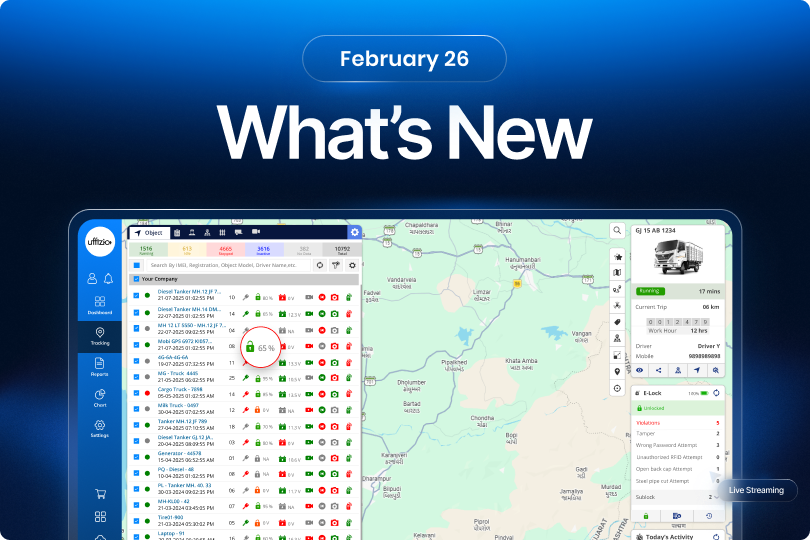
We’re constantly improving our platforms to help you manage operations more efficiently and deliver better solutions to your customers. This month’s updates introduce several enhancements across tracking, video telematics, reporting, alerts, and smart waste management all designed to make everyday workflows smoother and more insightful.
1. Trakzee
1.1 Understand video streaming issues with built-in logs
When a video stream didn’t load earlier, users would only see messages like “Waiting for streaming from device.” But it was difficult to understand why the stream wasn’t working — whether it was a device issue, channel problem, or network delay. To make troubleshooting easier, we’ve introduced a Logs Terminal directly inside the Video Telematics module.
Now, while viewing live streaming or history playback, users can open a logs screen to see detailed communication logs related to that video stream.
What you can see in the logs
- Streaming requests and responses
- Device authentication status
- Channel connectivity updates
- Playback requests and recording checks
- Streaming errors or timeouts
Logs are displayed vehicle-wise and channel-wise, and live streaming logs automatically refresh so users can monitor issues in real time.
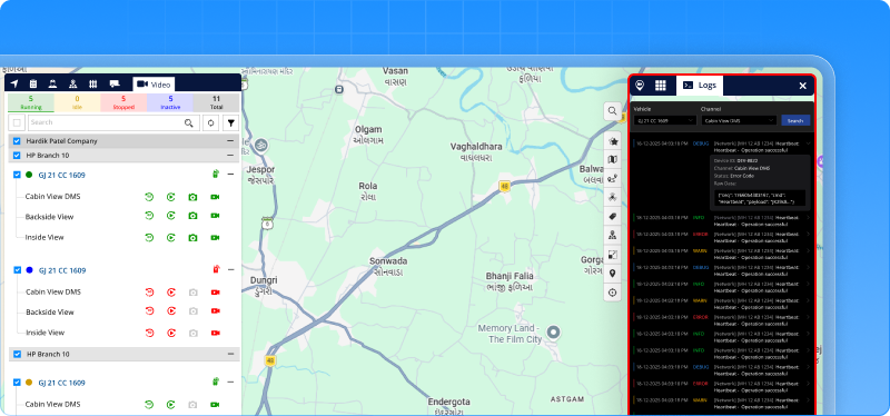
Why this matters
- Faster diagnosis when video streams fail
- Clear visibility into device and streaming behavior
- Less dependency on backend log checks
Now when a video doesn’t load, you don’t just see a message you can see exactly what’s happening behind the stream.
1.2 When a client says “We Use Twilio” you’re now ready
Some projects are simple. And then some start with: “We need SMS through Twilio.” Earlier, that meant slowing down for a moment. Checking compatibility. Adjusting configurations. Making sure everything aligned properly before going live.
Now, that pause is gone. Twilio is now directly supported within the system. It works seamlessly with existing SMS functions alerts, OTPs, location sharing without changing how messages are created or managed. No extra handling. No special adjustments. Just configure and move forward. What this really changes is confidence.
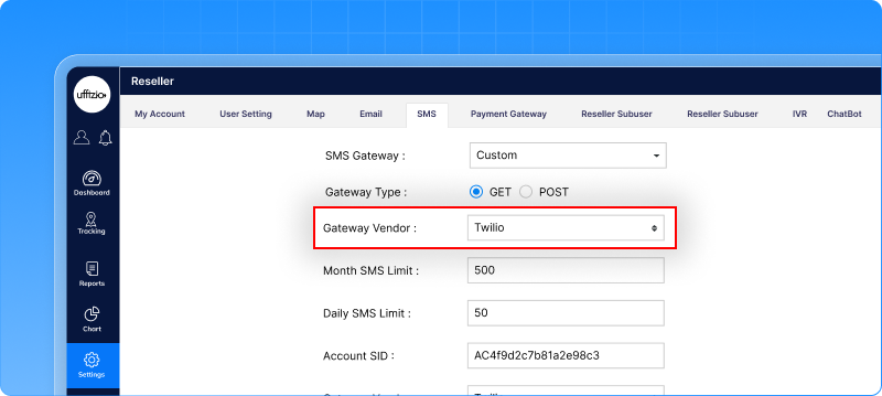 When Twilio is part of the requirement, you don’t need to rethink the setup. The platform is already prepared for it. SMS communication is now more globally aligned and deployment becomes that much smoother.
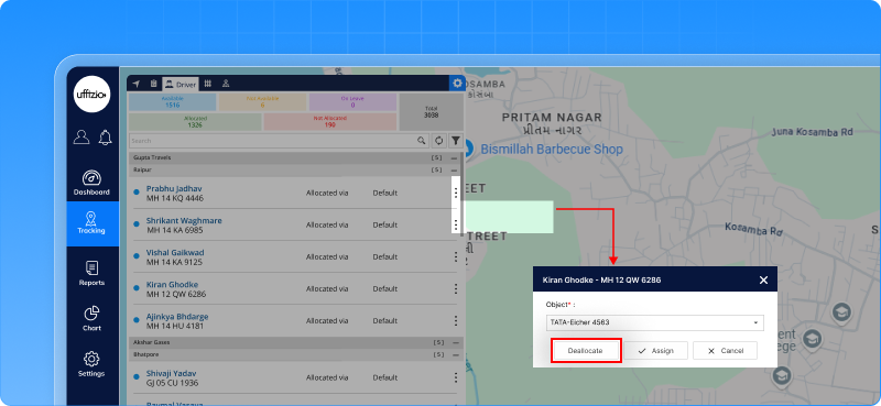
1.3 Driver deallocation now covers manual allocations too
In many deployments, drivers are allocated manually, not just through RFID. Earlier, automatic deallocation worked only for RFID-based assignments. So if a manually allocated vehicle stayed stopped or ignition was turned off, the driver would still remain assigned in the system unless someone removed it manually.
That gap is now resolved. Automatic deallocation now applies to manually allocated drivers as well. If the vehicle remains in Stop status or ignition stays OFF for the configured duration, the system removes the driver allocation automatically. This works when ignition data is available, ensuring the action reflects actual vehicle status.
Why this adds value
- Driver–vehicle mapping stays accurate without manual follow-ups.
- Allocation data reflects real vehicle activity.
- Reports become more reliable.
- Operational control becomes tighter and cleaner.
It ensures that driver management remains consistent no matter how the driver was assigned.
1.4 Spot low E-Lock batteries instantly from the vehicle list
For vehicles using E-Lock devices, keeping an eye on battery levels is important to avoid unexpected unlocking issues. Earlier, checking the battery required an extra step. Users had to select a vehicle and open its details to see the battery percentage. When managing many vehicles at once, this made quick monitoring difficult.
Now, the battery level of E-Lock devices is visible directly in the Object List itself. If a vehicle has an E-Lock device, its battery percentage appears alongside the vehicle in the list. This means users can quickly scan the list and immediately identify devices that may need attention. Vehicles without E-Lock devices simply won’t show this icon, keeping the list clean and easy to read.
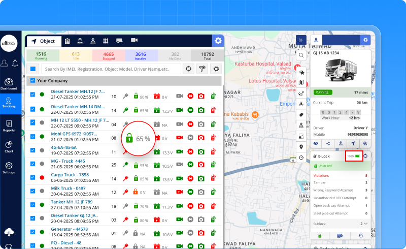 Why this adds value
- Faster battery monitoring across multiple vehicles
- Less dependency on opening vehicle details
- Quick identification of low-battery E-Lock devices
- Improved operational responsiveness
It’s a small UI improvement but it makes large fleet monitoring noticeably easier.
1.5 View only the days that matter in daywise reports
Earlier, when generating the Daywise Distance or Work Hour report, selecting a month meant getting all days from 1 to 31 whether they were needed or not. In many cases, users only needed specific dates. But the report always displayed the entire month, making it longer, heavier, and sometimes harder to analyse.
Now, that flexibility is added. Users can select specific days within a selected month. The report will display only those chosen days as columns. If no specific days are selected, the report continues to behave as before showing the full month. Scheduled reports also follow the same logic. If certain days are configured, only those days are included. If not, the full month is generated.
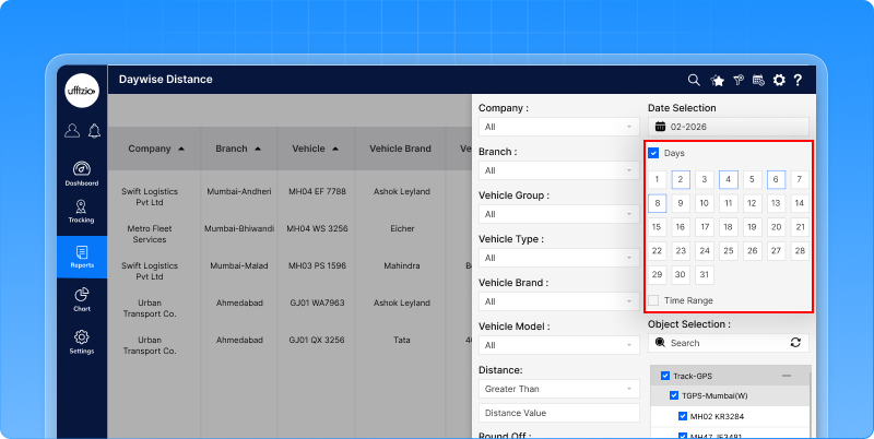 Why this adds value
- Cleaner reports with only relevant data
- Better readability and faster analysis
- Improved performance for large datasets
- More control in scheduled reporting
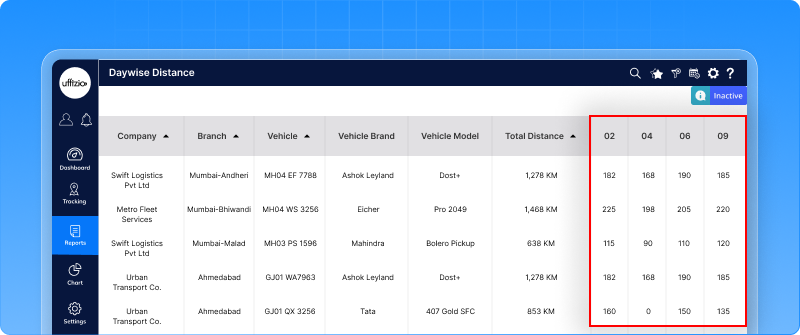 Instead of reviewing 30–31 days every time, users can now focus only on the dates that matter.
1.6 Now send commands to multiple vehicles in one go
Applying device commands is a regular task, whether it’s configuration updates, parameter changes, or resets. Earlier, this had to be done one vehicle at a time. For large fleets, that meant repeating the same process again and again.
Now, commands can be applied to multiple vehicles at once using a simple Excel upload. Users can download a sample file, enter vehicle details along with the command message, and upload it back into the system. The platform automatically validates the data before applying any command. If something is missing or incorrect, clear error messages are shown. If validation fails, no command is executed.
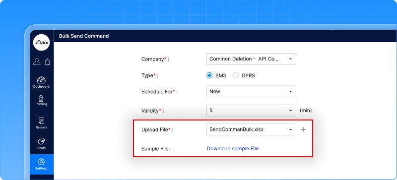 Why this makes a difference
- Saves time when managing large fleets
- Reduces repetitive manual effort
- Minimizes human error
- Brings better control before execution
Instead of sending commands one by one, the process is now structured, validated, and scalable.
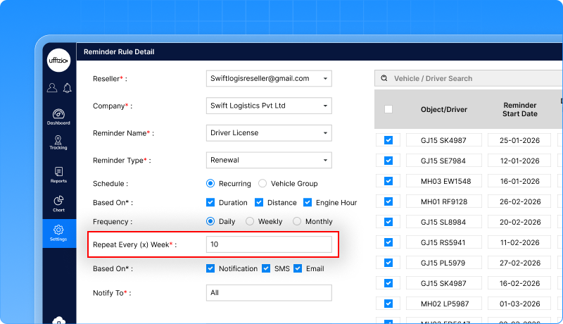
1.7 Daily reminders, now with more flexibility
Daily reminders were once created, and they ran every single day. But in real operations, not every reminder needs to trigger daily. Sometimes the requirement is “every 3 days” or “every week” starting from a specific date. Earlier, there was no way to control that interval.
Now, Daily reminders come with added flexibility. When selecting Daily frequency, users can define a Repeat Every (X) Days option. This allows reminders to run every 1 to 15 days, based on the chosen start date. If set to 1, it behaves exactly like before daily. If set to 3, the reminder runs every 3 days from the start date. Existing reminders remain untouched. The new logic applies only to newly created or edited reminders.
1.8 Temperature alerts just got smarter
Temperature monitoring has now been upgraded to offer more control and better accuracy. Earlier, alerts were simple, one condition per sensor, basic checks, and limited flexibility. Now, temperature alerts are more refined and reliable.
Temperature readings are now validated after applying calibration, ensuring alerts are based on corrected values. Multiple temperature conditions can be defined for a single sensor. This means you can monitor different ranges separately for example, warning and critical levels.
Alerts are now generated clearly at:
- Object level
- Sensor level
- Individual rule level
Each condition works independently, giving better clarity on what exactly triggered the alert.
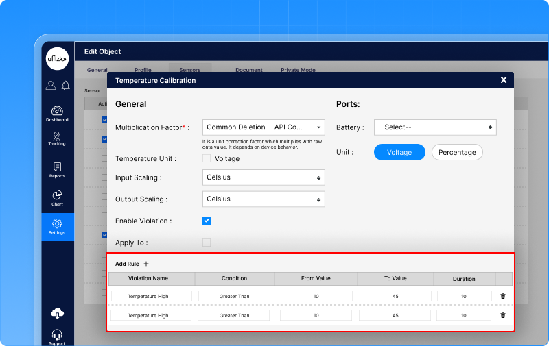
Why this matters
- More accurate temperature monitoring
- Better flexibility in defining ranges
- Clearer alert tracking
- Improved reliability in critical operations
Temperature alerts are no longer basic; they are now structured, configurable, and dependable.
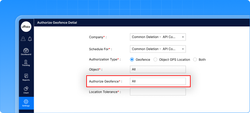
1.9 E-Lock unlocking is now smarter and more secure
Earlier, E-Locks were unlocked based only on geo-fence location. If the container entered the allowed area, it could be opened. But in real operations, location alone is sometimes not enough. What if the right vehicle isn’t present? What if unlocking should happen only when both the vehicle and location match? Now, that extra layer of control is available. E-Locks can now be linked clearly to a specific vehicle. And when it comes to unlocking, you can decide how strict the system should be.
You can allow unlocking:
- Only inside a defined area
- Only when the correct vehicle is physically present
- Or only when both conditions are met
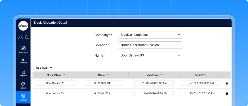 If both checks are selected, the lock will open only when the container is in the right place and near the assigned vehicle. This gives better control over when and how unlocking happens.
What this improves
- Stronger security for containers
- Better control over field operations
- Reduced risk of incorrect unlocking
- Clear mapping between E-Lock and the vehicle
 Unlocking is no longer just about being inside a location — it’s now about being at the right place, with the right vehicle.
1.10 Track every E-lock allocation, clearly and completely
E-Lock allocations were always visible inside the allocation screen. But when someone needed to check history how many times a lock was assigned, for how long, or to which vehicle, there was no proper report to rely on. That visibility gap is now closed. A new E-Lock allocation report is introduced, giving a clear picture of allocation activity both at a summary level and in full detail.
You can view summary and Detail together or separately depending on what you need.
![]() Download options
Download options
The report can be downloaded in Excel or PDF.
You can choose:
- Summary only
- Detail only
- Both combined
- Single sheet or multiple sheets
Everything stays structured and easy to audit.
1.11 More alerts can now trigger commands automatically
Earlier, only the Idle alert allowed actions like sending a command to the vehicle when triggered. But in real operations, many other alerts are just as critical harsh driving events, power issues, or long non-stop drives. Yet, they couldn’t trigger commands automatically. Now, that flexibility is extended.
The send command option is now available for:
- Harsh acceleration
- Harsh braking
- Harsh cornering
- Power
- Non-stop drive
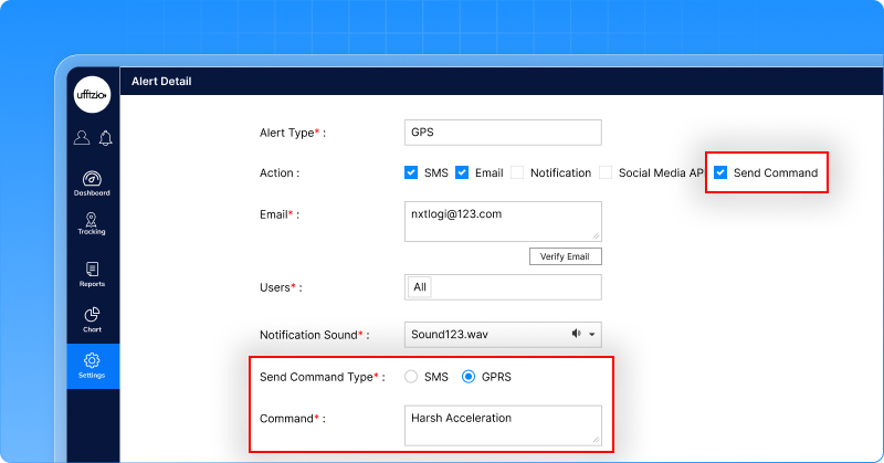
Just like Idle alerts, these alerts can now automatically send a configured command when the condition is met. The behavior remains consistent across both Web and Mobile applications.
Why this adds value
- More automated control during critical events.
- Faster response to unsafe driving behavior.
- Better operational consistency across platforms.
- Reduced need for manual intervention.
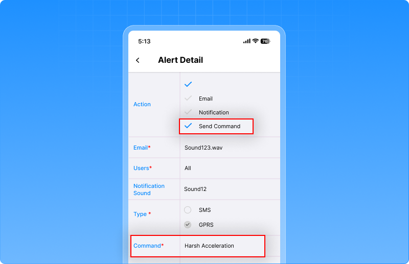 Instead of just receiving an alert, the system can now act on it instantly.
1.12 Find any screen in seconds with global search
Ever found yourself clicking through menus just to reach one screen?Reports here. Settings there. One more click. Then another. Now, you don’t have to remember where anything sits.
We’ve introduced global search a simple search bar that helps you jump directly to any screen. Just start typing, and matching screens appear instantly in a clear menu path format. Click, and you’re there. It only shows what you have access to. No confusion. No extra options.
We’ve also made the experience smoother:
- Press Enter → it opens the selected screen
- Press ESC → it closes the search
- Press Tab → focus stays in search
It’s fast. It’s clean. And it saves time every single day.
1.13 Export video telematics data straight from the dashboard
Video telematics dashboards give a quick overview of fleet safety but many teams also need the same insights in reports for sharing, analysis, or review. To make this easier, we’ve added XLS and PDF download options directly in the tabular view when users open detailed data from dashboard widgets.
Now, when you click on the tabular view from widgets like:
-
Fleet Average Score
-
Driver Score Distribution
-
Top 5 Risky Drivers
-
Event Heatmap
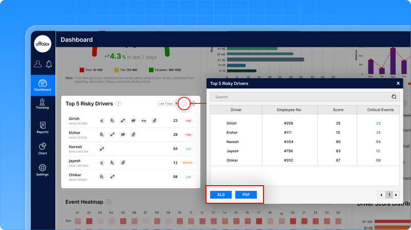
You can instantly download the same data in XLS or PDF format.
2. Smartwaste
2.1 From simple forms to structured surveys: a major upgrade to the Surveyor app
Field surveys are the foundation of any smart waste management system. The more accurate the property data, the smoother the collection planning, monitoring, and reporting become.
Earlier, surveyors added properties using a simple one-page form. While it allowed basic data entry, it often made detailed property documentation difficult. There was limited structure, and surveyors had little visibility into their daily progress or pending data syncs.
To make field work easier and more reliable, the Surveyor mobile app has been significantly enhanced with a new dashboard and a guided data collection workflow.
A new dashboard for real-time survey progress
Instead of a simple landing page with basic options, the Surveyor App now opens with a clear dashboard that helps surveyors instantly understand their work status.
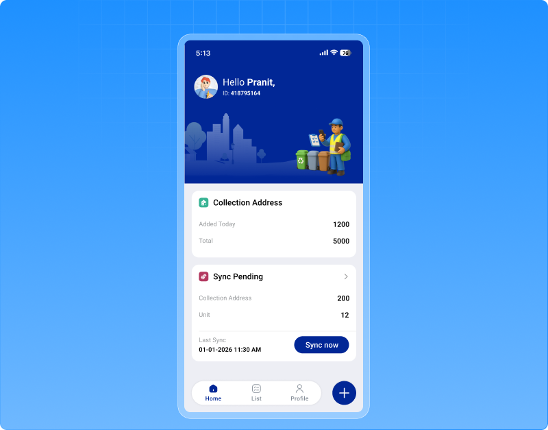 The dashboard includes:
Properties added
Shows how many properties the surveyor has added today and in total, helping track daily productivity.<
Units added
Displays the number of units recorded under properties, giving better visibility into survey coverage.
Sync overview
Shows records that are pending sync and already synced, ensuring surveyors know when data has been successfully uploaded to the system. This dashboard makes it easier for field teams to monitor their progress and confirm that their work is safely synced.
Step-by-step property registration
The property registration process has now been redesigned into a guided 4-step workflow, making it easier to capture complete and structured data.
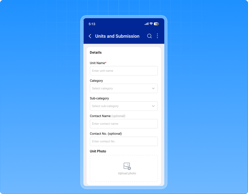
Step 1 – Property information Surveyors record key property details such as property name, owner information, category, waste type, bin details, and GPS-based location data.
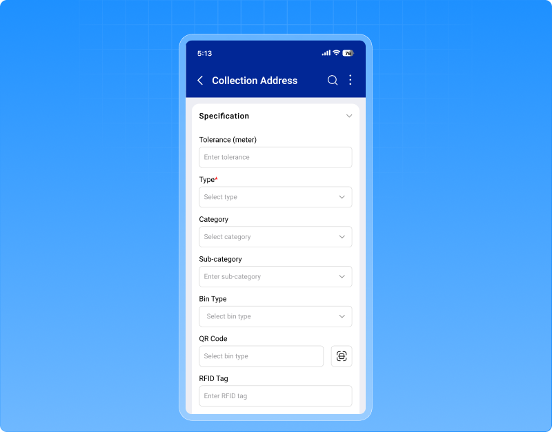 Step 2 – Photos Surveyors can capture or upload images of the property and waste bins, helping create visual records for verification and audits.
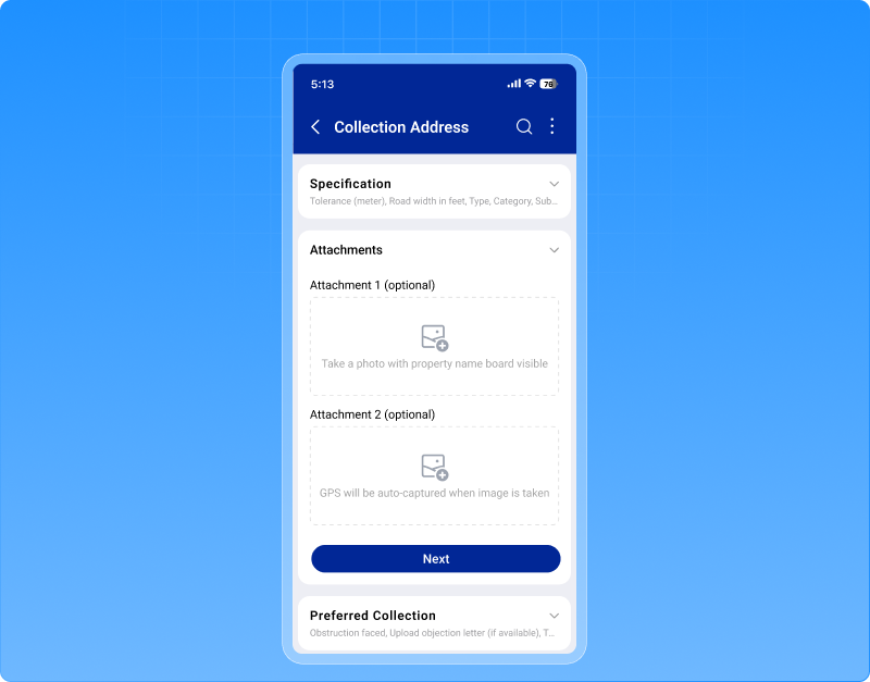 Step 3 – Additional information
Details such as number of bins, preferred collection timing, and non-working days can be added to support better route planning.
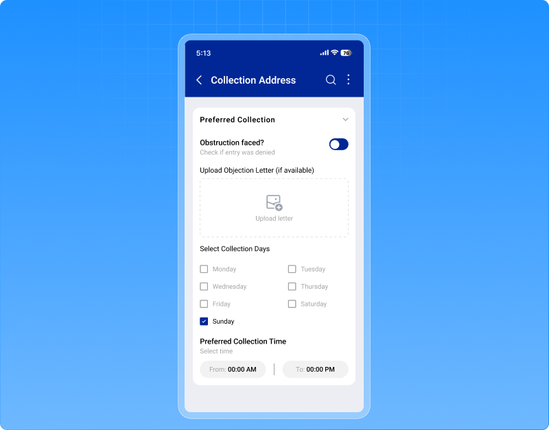
Step 4 – Units & submission Surveyors can add unit-level details such as flats, shops, or offices within the property, including contact information and images where required.
The entire process supports offline data capture, allowing surveyors to continue working even without internet connectivity. Data automatically syncs once connectivity is restored.
Why this enhancement matters
This improvement makes the survey process more structured, accurate, and transparent, which ultimately strengthens the entire waste management workflow.
- Better visibility of surveyor productivity
- More detailed property and unit-level data
- Reliable image and location records
- Smooth offline data capture with sync tracking
- Stronger foundation for collection planning and monitoring
2.2 Now track waste collection at unit level not just address level
In many cities, one collection address doesn’t mean one household.
It could be:
- 40 flats in one building
- 20 shops in one market
- Multiple offices inside one complex
But earlier, SmartWaste treated every collection address as just one checkpoint. That meant limited visibility. You could see if the address was visited but not how many actual units were covered. That changes now. We’ve introduced unit-level visibility inside SmartWaste. Now, every Collection Address can have multiple Units mapped to it, like flats, shops, offices, tenants, and the system shows exactly how many are linked. And it doesn’t stop there.
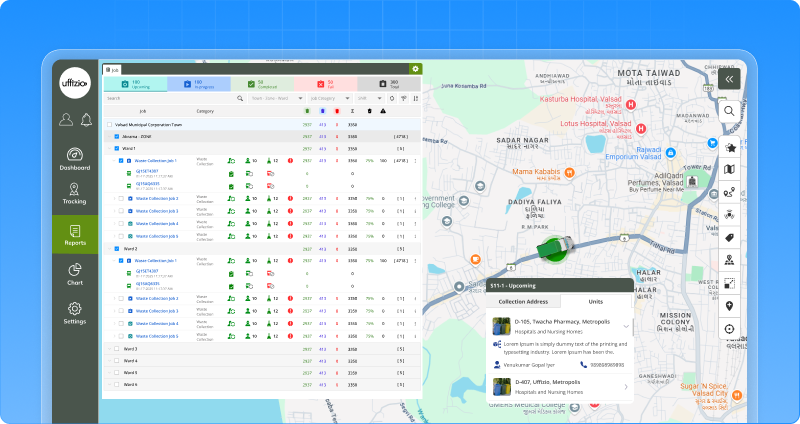
This unit information is now visible across:
- Job configuration
- Checkpoint status report
- Live tracking
Smarter job planning with “consider units” option
A new option — “consider units as collection address” — lets you decide:
- Work at the normal address level (existing way), or
- Plan jobs based on the total units under each address
If enabled, planned checkpoints are calculated based on Units. If an address is visited, all its units are automatically marked visited.
Stronger monitoring & reporting
- Unit count visible in reports
- Detailed unit information available on click
- Unit details visible directly from live tracking
Now, waste collection is tracked the way it actually happens at the real service level.
2.3 Unit-level visibility now in manager and collector mobile app
Earlier, the mobile app showed each collection address as a single checkpoint. There was no visibility of how many flats, shops, or units were actually linked to it.
Now, supervisors can see unit count directly under each collection address during job execution.
When viewing a Collection Address in the Job tab, users can now see:
- Total units linked
- Visit status
- Visit time
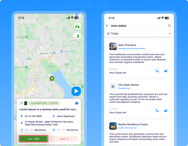 With one tap on the unit count, they can view full unit details like:
- Unit name
- Category (Residential, Commercial, etc.)
- Contact details (tap-to-call)
- Unit image preview
Even on the map, units can be viewed clearly.
Reports & collector app also updated
- Checkpoint status report now shows unit count
- Unit details can be viewed from the report
- Collector App shows unit count against each collection address
2.4 Clearer zone & ward performance now in one smart table
When municipalities handle dozens of zones and wards, dashboards can quickly become cluttered. Charts look good but when the data grows, clarity drops. So instead of adding more graphs, we’ve introduced a structured Collection Performance widgetin SmartWaste.
To solve this, we’ve introduced a structured Collection Performance widget in SmartWaste, designed in a clean tabular format for better clarity and scalability. Now, after selecting a Town, supervisors can instantly see performance at both the zone and ward levels without visual clutter.
The widget allows switching between Job-wise and Collection Address-wise views. This helps teams understand job distribution, vehicle allocation, completion status, delays, missed checkpoints, and overall performance percentage, all in one place. Instead of scattered information, summary indicators like Average Efficiency, Total Jobs, Delayed counts, and Service Coverage give a quick operational snapshot. For deeper analysis, users can open a detailed view and download the data when required.
![]() Why this matters
Why this matters
- It makes workload distribution easier to understand.
- It improves zone-level accountability.
- It handles large municipal data without slowing down the dashboard.
Now performance tracking feels structured, clear, and decision-ready even at scale.
2.5 Instantly create a new job from missed collections
After a job is completed, one question always comes up: “What about the missed addresses?”
Earlier, supervisors had to manually create a new job and reselect all the missed collection points. This took time and sometimes led to errors. Now, that extra effort is gone. From Live Tracking or Job Reports, users can directly click on the missed collection count and choose “Create Job Using Missed.”
The system automatically:
- Opens the job creation screen
- Prefills only the missed collection addresses
- Plots them on the map
- Copies the original job configuration
Everything remains editable. Users can add more points, remove some, change sequence, update vehicle or schedule and then save. If there are no missed addresses, the system simply shows a message. No unnecessary steps.
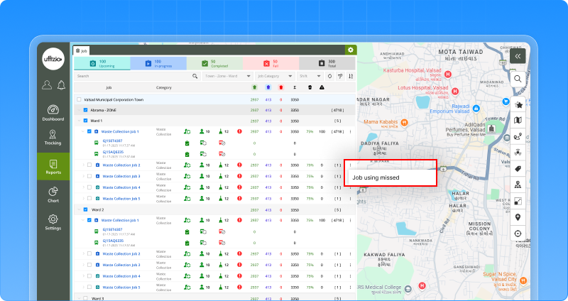 Why this matters
- Faster corrective action
- No manual re-selection of checkpoints
- Reduced operational errors
- Quick turnaround for service gaps
Now, missed collections don’t create extra workload; they create instant action.
2.6 See missed alerts directly inside the Job
During a running job, alerts like sequence missed are generated by the system. But earlier, managers had to look elsewhere to understand what happened. There was no clear link between a specific collection address and the alert raised for it. And even if a manager added a comment, it wasn’t easily visible during review.
Now, everything is connected. Inside live tracking → job tab, collection addresses that trigger alerts now show an Alert tag directly in the list.
With one click, managers can see:
- Alert type
- Time of alert
- Vehicle details
- Alert status
And most importantly — they can add a comment explaining the reason for the missed point. That comment stays visible while reviewing the job later.
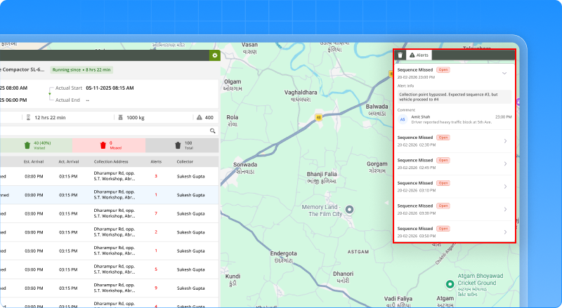
Why this matters
- Clear traceability at collection-address level
- Faster investigation during live monitoring
- Better documentation for audits
- Stronger operational accountability
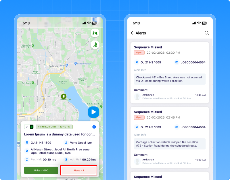
Now, when a collection is missed, the system doesn’t just raise an alert — it gives context, clarity, and record.
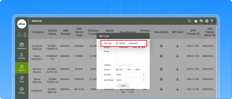
2.7 Separate vehicle QR and feedback QR, no more confusion
Earlier, QR codes in SmartWaste were generated without clearly separating their purpose. This created confusion especially when QR codes meant for vehicles were used where citizen feedback was expected.
Now, the system clearly asks: Vehicle QR or Feedback QR?
What this means in real use
- Vehicle QR is used for identification and internal operations.
- Feedback QRis meant for citizens.
When a citizen scans the Feedback QR placed on a vehicle or container, they are directly taken to the SmartWaste feedback page where they can:
- Submit complaints
- Share service feedback
- Report missed collections
This ensures the right QR leads to the right action. Even in bulk downloads, users must first select the QR type — so there is no mix-up.
 Why this matters
- Citizens can easily lodge complaints or feedback
- No confusion between operational and public QR codes
- Cleaner and more reliable feedback process
Now QR codes are not just printed they connect citizens directly to the system.
2.8 Clearer feedback tracking with job & vehicle details
Now that citizens can scan the feedback QR and submit complaints directly, tracking that feedback becomes even more important. Earlier, in the Feedback Summary report, you could see the ward and feedback details but it was not always clear:
- Which job was running at that time?
- Which vehicle was involved?
Now, the Feedback Summary report includes two new columns:
Job – Shows the name of the job when the feedback was submitted.
Object – Shows the vehicle linked to that job.
These columns appear alongside the existing ward details and are also available in exports and scheduled reports.
![]() Why this matters
Why this matters
- Clear linkage between citizen feedback and actual field operations
- Easier investigation of complaints
- Better accountability at job and vehicle level
- Stronger audit and reporting support
Now feedback is not just recorded it is properly connected to the real operation behind it.
2.9 Add SOP instructions directly inside alerts
When an alert is triggered, the control room reacts immediately. But earlier, alerts only showed what happened not what should be done next. Teams had to rely on memory, external documents, or manual instructions. Now, every alert can have a defined SOP (Standard Operating Procedure) attached to it.
A new SOP definition section allows defining clear instructions for each Alert Type.
For example:
- What steps to take
- Whom to inform
- What action to perform
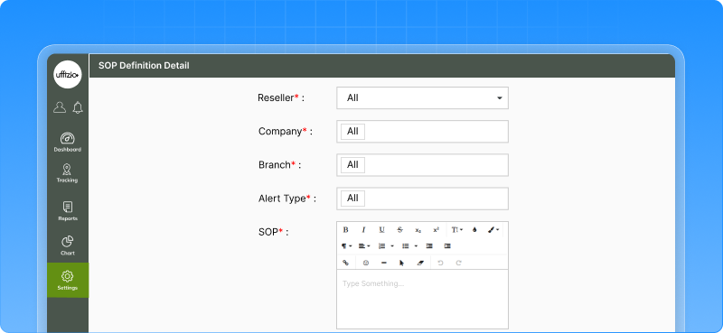
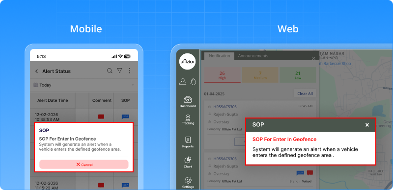
Once defined, the SOP automatically appears:
- In alert reports
- In alert status views
- In web notifications
- In mobile reports
The SOP is shown along with the alert, so the response team knows exactly what action to take instantly.
Why this matters
- Faster and standardized response
- No confusion during critical alerts
- Clear guidance for control room teams
- Better accountability and documentation
Now alerts don’t just notify they guide action.
2.10 Now see exactly how a visit was marked
Earlier, when a collection point showed visited, you could see the result but not the reason. Was it scanned using RFID? Was it validated by location (Map)? Was it marked using a QR Code? There was no clear visibility.
Now, that’s changed. A new column called “Visited Via” is now visible in:
- Live tracking (after visit completion)
- Job detailed summary report
- Mobile manager app
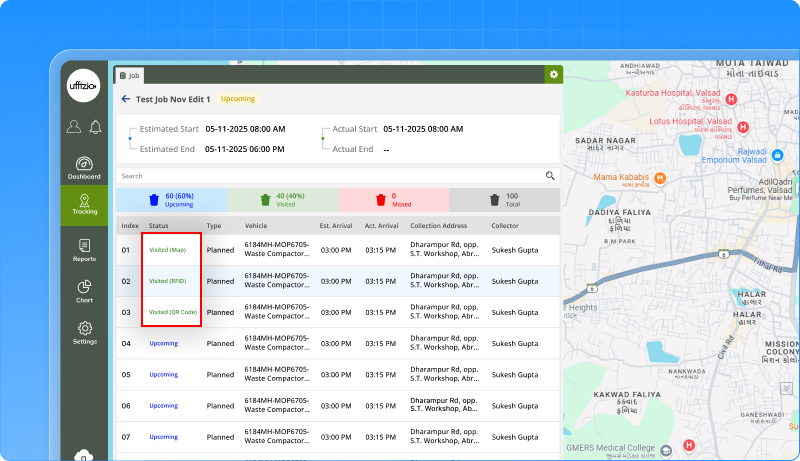 It clearly shows how the visit was marked:
- RFID
- Map
- QR Code
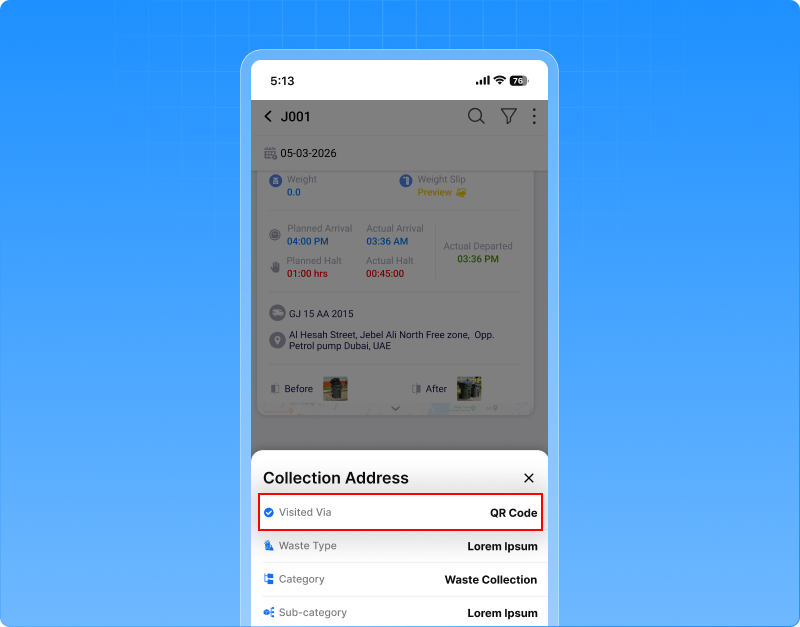 The value reflects the final method used during the visit. Even if the RFID scan happens slightly after the vehicle leaves the location, it is still treated as a valid RFID visit. Now, a visit doesn’t just show Visited, it shows how it was completed.
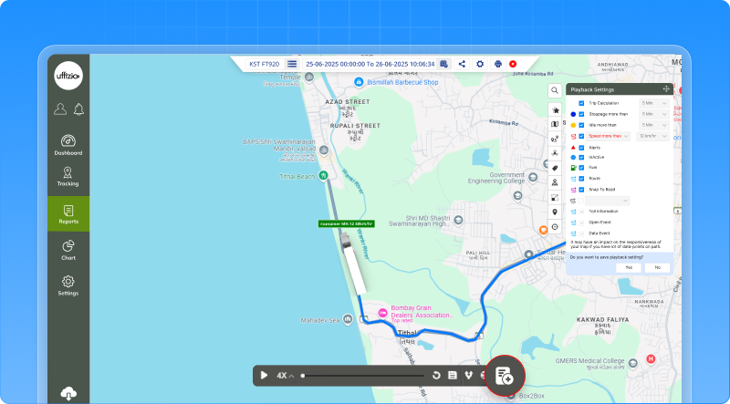
2.11 Create jobs directly from playback
Earlier, when creating a job from the Playback screen, the system only showed the route start point, end point, and vehicle path. Collection addresses (checkpoints) were not included. There was no option to choose a specific playback date. And users couldn’t decide whether to include checkpoints or not. That made the flow incomplete compared to normal Job Creation.
Now, it’s fully enhanced. While creating a job from Playback, the system now:
- Shows start point, end point, and full route
- Displays collection addresses (checkpoints) from that route
- Allows selecting the playback date (Today, Yesterday, or Custom)
There’s also a “With Checkpoints” option.
If enabled → Route + checkpoints are included.
If disabled → Only route is added, without checkpoints.
This works exactly like the Job Creation flow from Master settings keeping both processes consistent.
 Why this matters
More accurate job planning
Less manual rework
Better flexibility while creating corrective or planned jobs
Complete alignment with standard job creation flow
Now, creating a job from playback is not limited it’s complete and configurable.
2.12 Better control with a new “data access” section for collectors
Earlier, all collector settings were placed inside the general tab, including operational details and permission-related options. As more controls were added, this made the screen harder to manage and understand. To make things clearer, we’ve introduced a new “data access” tab in the collector detail screen.
Now, all permission-related options are grouped in one place. Settings like picture upload rules, vehicle inspection requirement, bin management, and unplanned checkpoint visits are moved to this new section, keeping operational details and access controls properly separated. Along with this, a new permission called manual billing rights has been added. When enabled, the collector can perform payment collection activities from the mobile application. If the permission is not granted, the payment option will not appear in the collector’s app.
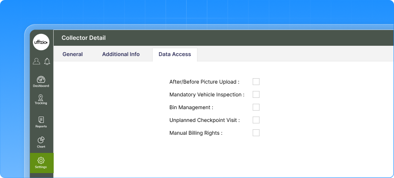 Why this matters
- Better control over operational permissions
- Clear visibility of what actions a collector is allowed to perform
Now collector configuration is easier to manage with access rights clearly separated from general details.
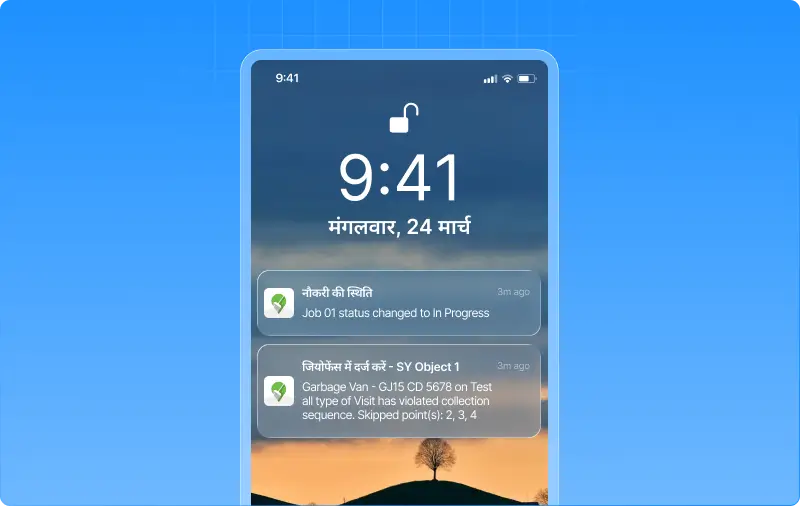
2.12 Alerts now speak your company’s language
When teams work in different regions, language matters. Alerts should be understood instantly without needing to interpret or translate them. Now, notifications automatically appear in the company’s selected language, including the notification heading. So if a company operates in Hindi, Spanish, Arabic, or any other supported language, the alert heading will appear exactly in that language — making notifications feel natural and easier to understand for the entire team.
This applies to mobile push notifications, ensuring field teams and managers immediately recognize alerts in the language they are comfortable with. If a translation is not available for a specific notification, the system will automatically fall back to the default English heading, ensuring nothing is missed.
Why this matters
- Alerts become instantly understandable for regional teams
- A more localized and user-friendly experience
- Faster response because alerts are easier to read
Now alerts don’t just notify they communicate in the language your team speaks every day.
And…
With these updates, we continue to strengthen the platform with smarter tools, clearer insights, and smoother workflows. Each enhancement is designed to make day-to-day operations easier while giving you better control and visibility across your system. More innovations and improvements are on the way as we keep evolving the platform to support your business.