We’re always improving our software to make your daily work easier. Our latest updates focus on better visibility, smoother operations, and simpler workflows. Each enhancement is designed to help you save time, reduce manual effort, and manage your operations more efficiently. Explore what’s new and see how these updates make a real difference in your day-to-day work.
Trakzee updates
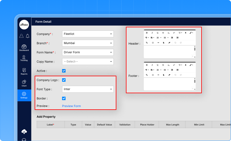
1.1 From plain to professional: branded PDF forms are here
Drivers fill in job-related forms at checkpoints using the Driver App. Earlier, when these completed forms were exported as PDFs, they looked plain and unbranded. Companies had to manually edit them before sharing with clients or storing them as official records.Now, companies can export fully branded PDF forms automatically no manual editing required. Here’s what’s added:
- The company logo (already added in the company profile) will now appear automatically on every exported form.
- Companies can add their own text at the top and bottom of the form. This can include company details, contact information, or any important note they want to show on every form.
- Companies can choose:
- A preferred font
- Whether they want page borders
This helps forms look clean and presentable.
- A preview option lets users see how the final PDF will look—logo, header, footer, and style—before using the form.
How this helps the business
- Forms look official and professional
- No need for manual editing after export
- Saves time for operations and admin teams
- Improves brand visibility when sharing documents with clients
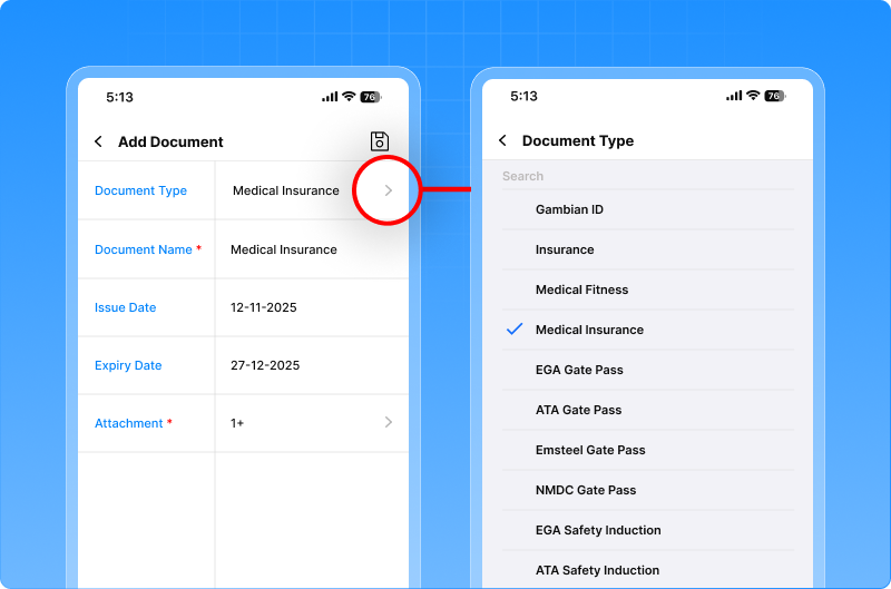
1.2 Never miss driver document renewals again
Drivers are required to carry different documents like medical papers, gate passes, and safety certificates. Earlier, users had to add such documents as custom entries, and reminders could not be linked to them properly. This made it easy to miss important expiry dates and follow-ups. We’ve added predefined driver document types that are now available across the system. New document types include:
- Medical Fitness
- Medical Insurance
- Gate Pass documents
- Safety Induction documents
What users can do now
Users can select these document types while:
- Uploading or downloading driver documents
- Creating or editing document reminders
This works smoothly on both Web and Mobile applications.
How this help the business
- No missed document renewals
- Better compliance with safety and site requirements
- Less manual tracking and follow-ups
- Cleaner and more organised driver records
1.3 Schedule reports now show created and modified details
Earlier, schedule reports did not show who created or updated a schedule, or when the change was made. This made it difficult for teams to track changes, especially when multiple users were managing schedules. We’ve added clear tracking details to schedule reports, so every change is easy to trace.Now, the following details are visible:
- Created date – when the schedule was first created
- Modified date – when it was last updated
- Modified by – who made the last change
![]()
How this helps the business
- Better control over schedule changes
- Clear accountability across teams
- Easier audits and internal reviews
- Fewer disputes about “who changed what”
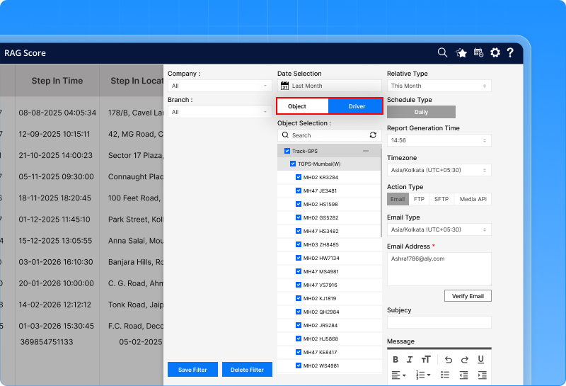
1.4 RAG scores can now be viewed by driver or vehicle
Earlier, the RAG score report showed performance only driver-wise. But many businesses also track performance vehicle-wise or asset-wise. Without this option, users had limited visibility and had to adjust their analysis manually. The RAG Score Report in the OPAL module can now be viewed in two ways:
- Driver-wise
- Object-wise
Users can easily switch between these views using a simple toggle.
Export and scheduled reports
- The selected view is applied to PDF and Excel exports
- Scheduled reports also follow the same selection
- The report title clearly mentions whether it is Driver-wise or Object-wise
How this helps the business
- Better performance analysis based on real needs
- Clear visibility at both driver and asset level
- Faster decision-making with flexible reporting
1.5 Beacon proximity alerts for better control
In many operations, beacons are attached to drivers, equipment, trailers, or assets and linked to a vehicle. Earlier, there was no way to know if a beacon moved away from its assigned vehicle or came back again. This made it harder to track asset movement and respond quickly to security or operational issues. A new Beacon Proximity Alert is now available in the GPS application. This alert checks the distance status between a vehicle and its linked beacon and shows whether the beacon is:
- Near
- Away
- Lost
Alerts are triggered automatically when the proximity status changes.
How it works
- Users can enable the Beacon Proximity alert from the Alerts settings
- Alerts can be configured:
- Vehicle-wise or beacon-wise
- For specific proximity states (only Lost, or all states)
- The system continuously checks the signal strength between the vehicle device and the beacon
- If the beacon moves away, comes back, or is completely lost, an alert is generate
![]()
How this helps the business
- Immediate visibility when assets or people move away from vehicles
- Better security and loss prevention
- Faster response to operational exceptions
- Improved tracking accuracy without manual checks
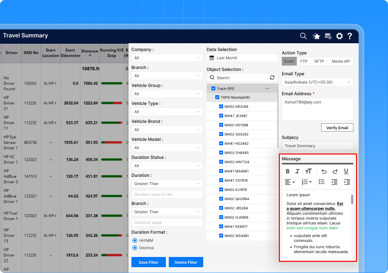
1.6 Scheduled report emails now support formatting
Earlier, while setting up scheduled reports, users could add only single-line text in the email message. There was no option to add line breaks, bullet points, or highlighted text.As a result, scheduled report emails looked plain and were harder to read. The message field in scheduled report settings now supports proper text formatting. Users can now write clean, well-structured messages that look professional when sent by email.
What users can do now
While setting up a scheduled report, users can:
- Write messages in multiple lines
- Add bullet points or numbered lists
- Highlight important text
- Add links where required
How this helps the business
- Scheduled report emails look more professional
- Important information is easier to read and understand
- Better communication with customers and internal teams
- Less need for follow-up explanations
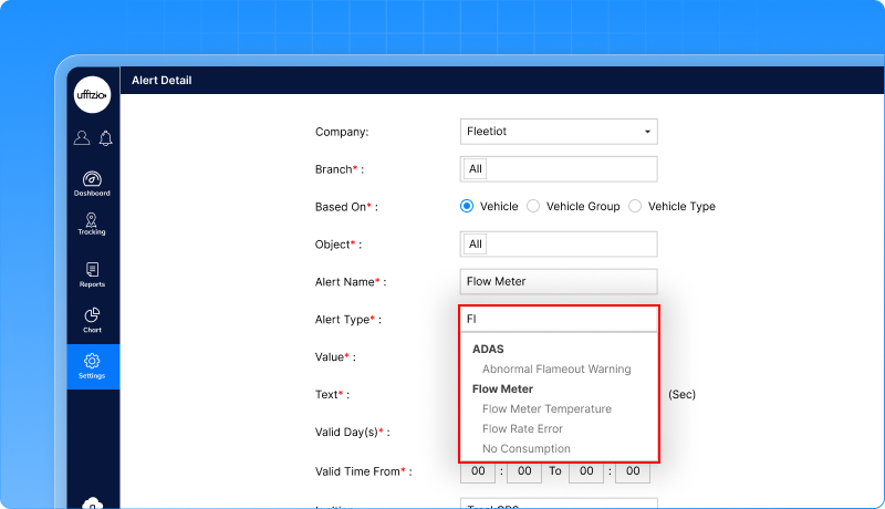
1.7 Smarter fuel monitoring with new flow meter alerts
In fuel monitoring, issues like stuck flow sensors, no fuel usage while moving, or abnormal temperature can lead to wrong data, fuel loss, or equipment damage. Earlier, users had limited visibility into such conditions and had to detect them manually. We’ve added new alerts in the Flow Meter module to automatically detect and notify fuel-related issues. The new alerts include:
- Flow Rate Error
- No Consumption
- Temperature Alert
How the alerts work
- Alerts can be configured vehicle-wise or asset-wise
- Each alert checks fuel data in real time
- If an abnormal condition continues for a defined time, the system triggers an alert automatically
How this helps the business
- Early detection of fuel meter faults
- More accurate fuel data
- Reduced fuel losses and downtime
- Faster maintenance action
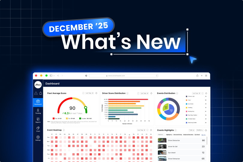
1.8 All your video telematics insights now on one dashboard
Fleet managers using video telematics had access to rich data, but it was spread across screens and not easy to view at a glance.
Identifying risky drivers, unsafe patterns, or critical video events required extra effort and time. We’ve introduced a dedicated set of Video Telematics Dashboard widgets in Trakzee. These widgets give a quick, clear, and actionable summary of driver behaviour, video events, and fleet safety—on both web and mobile.
What the new dashboard shows
Fleet average score
- Shows the overall safety score of the entire fleet
- Uses clear colour indicators to show safety levels
- Helps managers instantly understand fleet performance
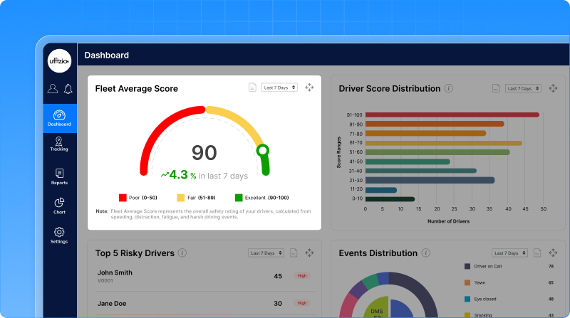
Driver score distribution
- Shows how drivers are spread across different score ranges
- Makes it easy to spot high-risk and safe driver groups
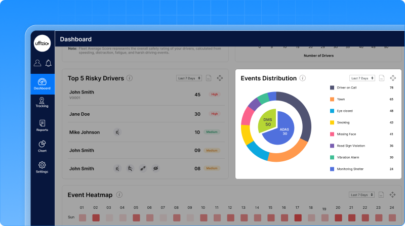
Top 5 risky drivers
- Highlights drivers with the lowest safety scores
- Shows major risky behaviours captured on video
- Allows quick access to detailed driver and video logs
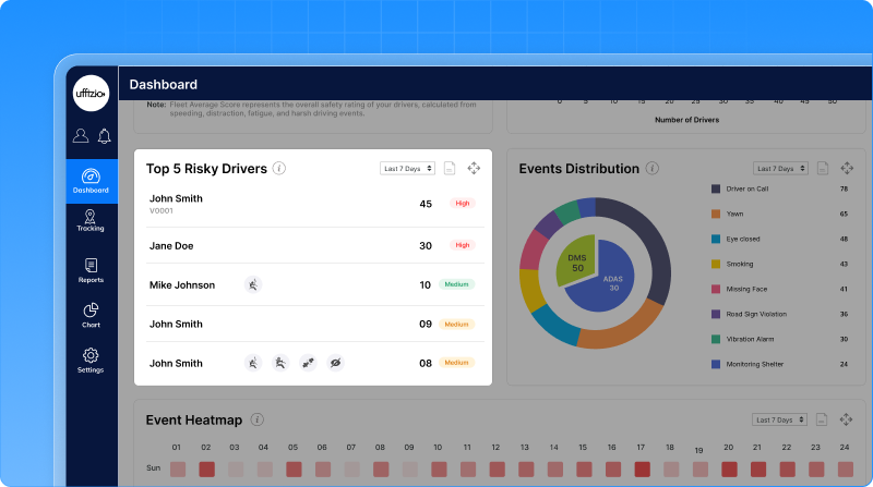
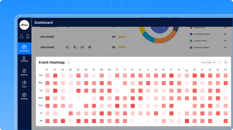
Events heatmap (Web)
- Shows when risky driving events happen most often
- Helps identify unsafe time slots or driving pattern.
Event distribution
- Breaks down video events by type
- Helps understand which unsafe behaviours are most common
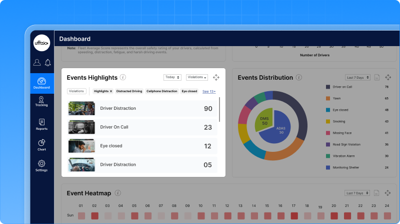
Event highlights (Revamped)
- Shows recent critical video events across the fleet
- Allows quick review of important incidents with video access
Mobile dashboard experience
On mobile, the most important widgets are optimized for quick viewing and easy action, allowing managers to:
- Track fleet safety on the go
- Review risky drivers and events instantly
- Access video details without switching screens
How this helps the business
- Faster identification of risky drivers
- Better use of video data for safety decisions
- Reduced accidents and unsafe driving behaviour
- Clear visibility without manual analysis
1.9 View job routes in google earth with KML export
Earlier, users could view job routes inside the system but could not export them for external use. If someone wanted to view a route in tools like Google Earth or share it with clients or authorities, there was no direct option. A new Download KML option is now available in the Job Overview screen. This allows users to export job routes as KML files with just a few clicks.
How it works
- A KML download option appears alongside existing download options in Job Overview
- Users select a job from the list
- The system generates and downloads the route file instantly
- The file is saved using the job name, making it easy to identify
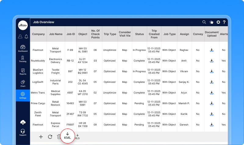
What users can do with the KML file
- Open job routes in Google Earth or map tools
- Visualise routes and checkpoints clearly
- Share route paths with clients or partners
- Use route data for analysis or reporting
1.10 No more guesswork on terms acceptance
Earlier, there was no single place to manage Terms and Conditions or ensure that users had actually read and accepted them. This made compliance tracking difficult, especially when working with multiple resellers, companies, and users. We’ve introduced a dedicated Terms & Conditions module in the GPS application. This module allows administrators to manage, display, and track acceptance of Terms and Conditions across Web and Mobile applications.
How it works
- Administrators can upload Terms and Conditions as a PDF or add them as formatted content
- Terms can be inherited across levels—from admin to reseller, company, and sub-users
- Each update creates a new version, ensuring a clear history of changes
First login acceptance
- On a user’s first login, the Terms and Conditions open automatically
- Users must accept before accessing the system
- Acceptance time and user details are stored for records
If the Terms are updated later, users are prompted again to review and accept the new version.
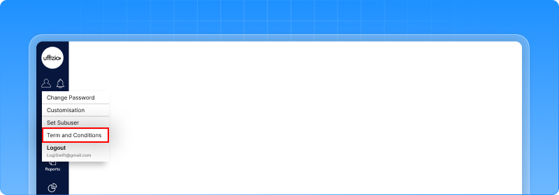
Anytime access for users
- Web users can view Terms and Conditions from the user menu
- Mobile users can access them from settings
- Both PDF and formatted versions are supported
How this helps the business
- Ensures compliance and transparency
- Clear record of who accepted which version and when
- Easy updates without manual follow-ups
- Consistent policy display across Web and Mobile
1.11 Multiple flow meters now supported per vehicle
Earlier, the Flow Meter module could handle only one flow meter per vehicle or vessel. This was not enough for assets with multiple engines, dual tanks, input–return fuel lines, or complex fuel setups. It also limited accuracy and reporting. The Flow Meter module is now fully upgraded to support multiple flow meters per asset. Each flow meter can now be configured, monitored, and reported independently, while still allowing a combined fuel view when required.
What users can do now
- Add multiple flow meters to a single vehicle or vessel
- Configure each flow meter separately
- Choose how fuel should be calculated for each meter
Each flow meter can work in one of two ways:
- Direct flow- Measures fuel directly from a single fuel line
- Delta flow- Measures actual fuel usage by comparing input and return lines
![]()
Improved live tracking view
The live tracking screen now shows:
- A summary view of total fuel usage
- Separate tabs for each configured flow meter
If any required sensor data is missing, the system clearly marks it as an error, avoiding wrong fuel values.
Enhanced flow meter reports
Flow meter reports are now designed to work with multiple flow meters per asset.
Users can:
- View fuel data object-wise and meter-wise
- See total and average fuel usage
- Analyse temperature and flow trends
- Export and schedule these reports easily
This gives a complete and accurate picture of fuel usage across engines or fuel lines.
How this helps the business
- Much higher fuel data accuracy
- Better handling of complex fuel setups
- Reduced fuel loss and wrong readings
- Reliable data for audits and analysis
1.12 Flow meter data, now explained through charts
After enabling support for multiple flow meters, users needed a simple way to visualise fuel and temperature data over time. Raw numbers alone made it hard to spot patterns, abnormal behaviour, or performance issues. We’ve added Flow Meter-based charts inside the Chart module. Users can now view clear visual trends for fuel consumption and temperature—both on Web and Mobile.
New flow meter charts available
- Temperature chart- Shows input and return line temperature over time. Helps identify overheating, abnormal temperature spikes, or imbalance in the line.
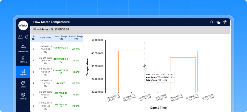
- Consumption chart- Helps understand real fuel usage trends clearly. Works for both direct and delta flow meters
![]()
How this helps the business
- Easy identification of fuel and temperature issues
- Better fuel usage analysis over time
- Faster troubleshooting and decision-making
- Stronger confidence in fuel data
1.13 Safer delete actions with password confirmation
Earlier, delete actions depended only on a security PIN, and in some cases, no extra confirmation was required at all. This increased the risk of accidental deletions, especially for critical data like users, branches, or companies. We’ve strengthened the delete process by adding password-based confirmation across the system. Now, deleting any critical record requires proper user authentication.
How it works
- If a user has enabled a Security PIN- The system asks for the PIN. The system also asks for the user’s password
- If no Security PIN is set- The system asks for the user’s password only
Deletion is allowed only after successful authentication. A clear warning message is shown before deletion, informing users that the action cannot be undone.
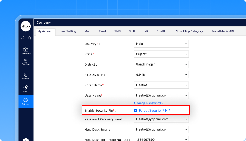
How this helps the business
- Prevents accidental data loss
- Adds an extra layer of security
- Ensures only authorised users can delete critical records
- Improves overall system reliability
1.14 More flexible reminder rules
Earlier, reminders were limited to one-time or monthly schedules. Users could not set weekly reminders, and configuring reminders for distance or engine hours often felt confusing and rigid. We’ve enhanced the Reminder Rule configuration to make it more flexible and easier to use—on both Web and Mobile.
Users can now set reminders based on:
- Daily
- Weekly
- Monthly
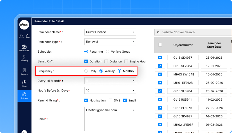
Choose what triggers the reminder:
- Time-based
- Distance-based
- Engine-hour-based
- Or a combination of all
The system shows only relevant fields based on the user’s selection, keeping the screen clean and easy to understand.
Clear Visibility in Reports
- A new Frequency column is added in reminder lists and reports
- Existing reminders are automatically updated and remain unchanged
- Reminder status reports clearly reflect the selected frequency and trigger type
How this helps the business
- More accurate and timely reminders
- Better planning for maintenance and compliance
- Less confusion while setting reminders
- Reduced chances of missed actions
1.15 CRM dashboard & reports for better ticket visibility
Earlier, the CRM module showed tickets in lists, but there was no clear view of trends, workload, or performance.
Managers could not easily track how many tickets were open, how fast they were resolved, or who was handling what.
We’ve added CRM Dashboard Widgets and Detailed Reports to give complete visibility into client tickets—on both Web and Mobile.
This helps teams track ticket status, priorities, trends, and resolution performance at a glance.
New CRM dashboard widgets
The CRM dashboard now includes visual widgets that show:
- Open vs Closed Tickets
- Tickets by Priority
- Tickets by User
- Average Resolution Time
- Daily / Weekly Ticket Trends
- Pending Ticket Aging
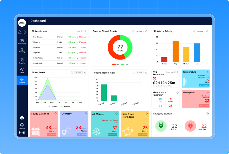
All widgets support filters like date range, project, priority, status, and ticket type. Clicking on any widget opens a detailed ticket list instantly. Users can quickly open the ticket and take action—without leaving the dashboard.
New CRM ticket summary report
A new Ticket Summary Report is added under the CRM module. The report shows Total tickets, Open vs closed tickets, Priority-wise breakdown, Average resolution time. Reports can be filtered, exported, and scheduled as needed.
![]()
How this helps the business
- Better control over support operations
- Faster identification of delays and bottlenecks
- Improved client response and satisfaction
- Clear performance tracking for teams
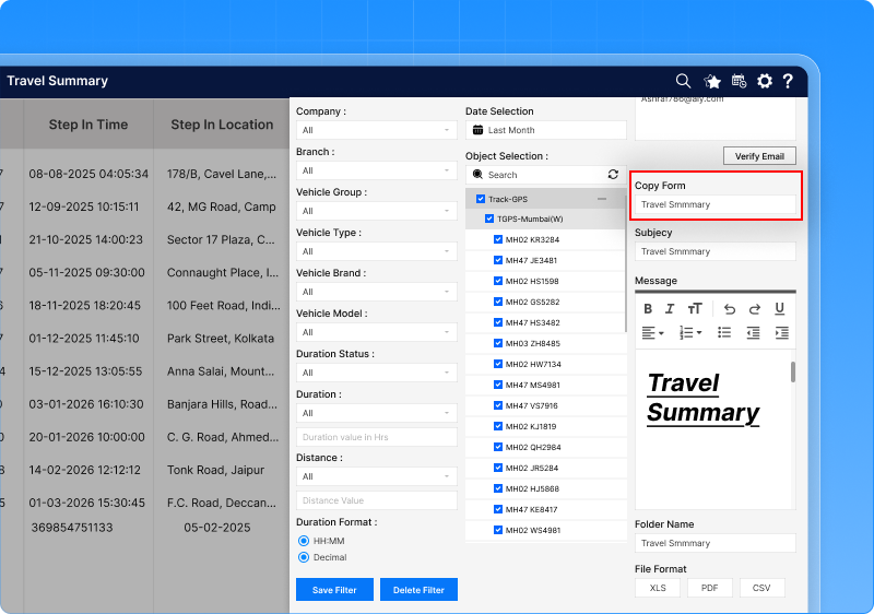
1.16 No more rewriting emails for scheduled reports
Earlier, every scheduled report required users to manually type the email subject and message. For teams managing many scheduled reports, this meant repeated work and inconsistent email content. We’ve added a “Copy From” option in the Scheduled Report configuration. This allows users to reuse the subject and message from an existing scheduled report in just one click.
How it works
- A copy from option appears above the Subject field
- Users select an existing scheduled report from the list
- The system automatically fills in Email subject
- Users can still edit the content before saving
Each new schedule is saved independently, even when copied.
How this helps the business
- Saves time while creating multiple scheduled reports
- Ensures consistent email communication
- Reduces manual errors
- Makes report management easier
1.17 Alerts now shown directly on the trip timeline
Earlier, while replaying a trip, users could see movement and status changes, but alerts were shown separately in reports. This made it difficult to understand when an alert occurred during a specific trip. Alerts are now displayed directly on the Trip Playback Timeline for a selected vehicle. This means users can see exact alert points mapped to the same timeline used for trip playback.
How it works
- On the Activity / Trip Playback screen, a new Alert toggle is available
- When turned ON:
- Alert markers appear on the trip timeline
- Each marker shows the exact time of the alert during the trip
- Alert markers appear on the trip timeline
- Hovering over a marker displays:
- Alert type
- Time of occurrence
- Additional details like speed or location
- Alert type
Users can also filter specific alert types while viewing the trip.
![]()
How this helps the business
- Clear trip-level incident analysis
- Faster investigation of alerts
- Better understanding of driver behaviour during a trip
- Reduced dependency on multiple screens
1.18 Cleaner, more accurate trip playback with snap to road
During trip playback, GPS points may sometimes appear slightly off the actual road due to signal gaps or inaccuracies. This made route playback harder to understand and less visually accurate, especially during trip analysis. We’ve added a Snap to Road option in the Trip Playback settings under Live Tracking. This feature aligns the playback route closer to the actual road, making trips easier to review and explain.
How it works
- A new Snap to Road checkbox is available in Playback Settings
- The option is disabled by default
- When enabled:- The playback path is corrected and aligned to the road. The correction applies only to the selected playback duration
- The corrected route is shown with a different colour, so users can clearly identify adjusted data
- Snap to Road works on:- OSM map, Google map, HERE map
How this helps the business
- More accurate and readable trip playback
- Easier route validation and analysis
- Better visual clarity during client reviews
- Improved trust in playback data
2. Smartwaste updates
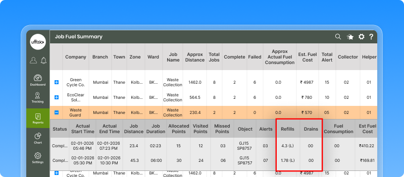
2.1 Fuel fill & fuel drain visibility in job reports
In waste collection operations, fuel usage directly impacts cost, efficiency, and planning. Earlier, fuel consumption was visible at a high level, but fuel fill and fuel drain events during a job were not clearly shown. This made it harder to understand fuel behaviour during actual collection activities.
We’ve enhanced the Job Fuel Summary Report to include fuel fill and fuel drain details for each job. Users can now clearly see how much fuel is filled during the job, Fuel Drained during the job. These values are captured and shown job-wise, making fuel analysis more transparent.
Where this is available
The new fields are added to:
- Job Fuel Summary Report
- Detailed job-level view
- Exported reports (PDF & Excel)
- Scheduled reports
If no fuel fill or drain event occurred during a job, the value is shown as 0, ensuring clarity and consistency.
How this helps waste operations
- Better visibility into fuel activities during collection jobs
- Easier identification of abnormal fuel behaviour
- Improved cost control and accountability
- More accurate performance and efficiency analysis
2.2 Visit coverage report for zones and wards
Earlier, the Zone–Ward Wise Visit Report showed how many addresses were visited, but it did not clearly answer an important question: How much of the ward was actually covered? Without a coverage percentage, it was difficult for authorities to:
- Measure on-ground performance
- Identify missed areas
- Compare wards or zones fairly
We’ve introduced a new Zone–Ward Wise Visit Report with percentage coverage, giving a clear picture of collection performance. This report helps users understand how complete the visits were, not just how many happened.
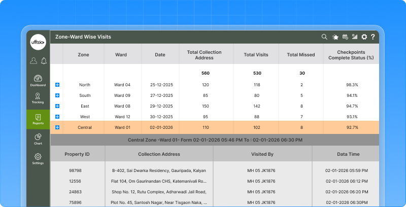
What the report now shows
The report includes:
- Zone
- Ward
- Date (job start date)
- Total collection addresses
- Total visits
- Total missed
- Checkpoint completion percentage (%)
This makes ward-level performance easy to track and explain.
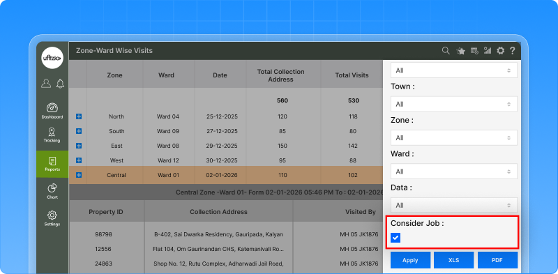
Job-wise and non-job-wise view
A new option allows users to choose how coverage should be calculated:
- Non-job-wise (default)- Calculates coverage based on all collection addresses in the ward.
- Job-wise- Calculates coverage based on checkpoints across all jobs in the ward.
This flexibility helps users analyse performance from both operational and planning perspectives.
How this helps waste operations
- Clear visibility of ward-level coverage
- Easy identification of missed areas
- Better accountability and performance tracking
- Improved planning for future collection cycles
2.3 Complaint management module for smart waste operations
Earlier, there was no structured way to register, track, and close waste-related complaints within the system. Complaints from citizens or field observations were handled outside the platform, making follow-ups, accountability, and reporting difficult. We’ve introduced a dedicated Complaint Management module in the Smart Waste Manager (SWM) application. This module allows authorities to log complaints, track their status, communicate with complainants, and generate reports—all from one place.
Complaint registration (Mobile App)
Managers can now register complaints directly from the mobile app, either:
- Linked to a collection address, or
- As an ad-hoc complaint
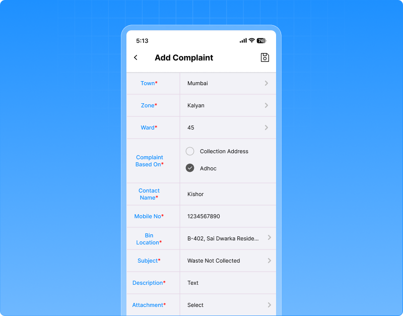
Each complaint captures:
- Subject and description
- Location details (Town, Zone, Ward, Address)
- Contact name and mobile number
- Optional image attachment for better clarity
Complaints are easy to filter using Town, Zone, and Ward, making large-area management simpler.
Complaint tracking & communication
For every complaint, users can:
- View complete complaint details
- Track status (Open / Closed)
- Add comments and feedback
- Manage conversation history with the complainant
![]()
To ensure authenticity, an OTP-based confirmation is required while closing a complaint. Whenever a complaint is raised notifications are sent to company users and sub-users based on their access rights
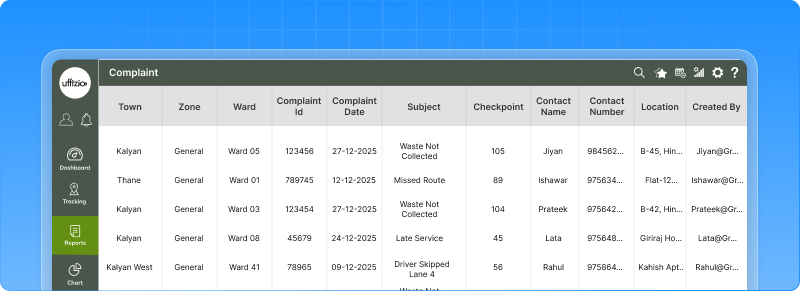
Complaint Reports & Visibility
A new Complaint Report is added under Reports, allowing users to:
- Filter complaints by Company, Branch, Town, Zone, Ward, Date, and Status
- View complaints in a card-based format with full details
How this helps waste operations
- Faster complaint resolution
- Better citizen satisfaction
- Clear accountability for field teams
- Centralised complaint data for analysis
Why this matters for system integrators & resellers
- Strong value addition for municipal projects
- Helps authorities demonstrate transparency
- Easy to position as a citizen-centric feature
- Complements collection, job, and reporting modules
2.4 Download VCR submission as PDF
Earlier, Vehicle Check Reports (VCR) submitted during a job could only be viewed inside the system. There was no simple way to download or share the complete VCR details for audits, records, or offline review. Users can now download the complete VCR submission as a PDF directly from job reports. This PDF captures all VCR details in a clean, professional format, ready to share or store. The VCR Download option is now available:
- In Job Detail Summary (summary and detailed view)
- Inside the VCR details popup, via a Download PDF button
Only authorised users can download the report.
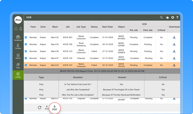
How this helps waste operations
- Easy sharing with auditors and authorities
- Better record-keeping and compliance
- Offline access to inspection data
- Saves time during reviews and reporting
2.5 Smarter surveyor App with dashboard & step-by-step data capture
Earlier, the Surveyor App had a basic landing screen and a single long form for adding properties. This made data entry tiring, inconsistent, and difficult to track—especially for large survey drives and offline fieldwork. We’ve completely enhanced the Surveyor Mobile App with:
New surveyor dashboard
The app now opens with a simple dashboard that helps surveyors track their work:
- Properties added (Today & Total)
- Units added (Today & Total)
- Sync status showing pending offline records and last sync time
This helps surveyors confirm progress and data sync before moving ahead.
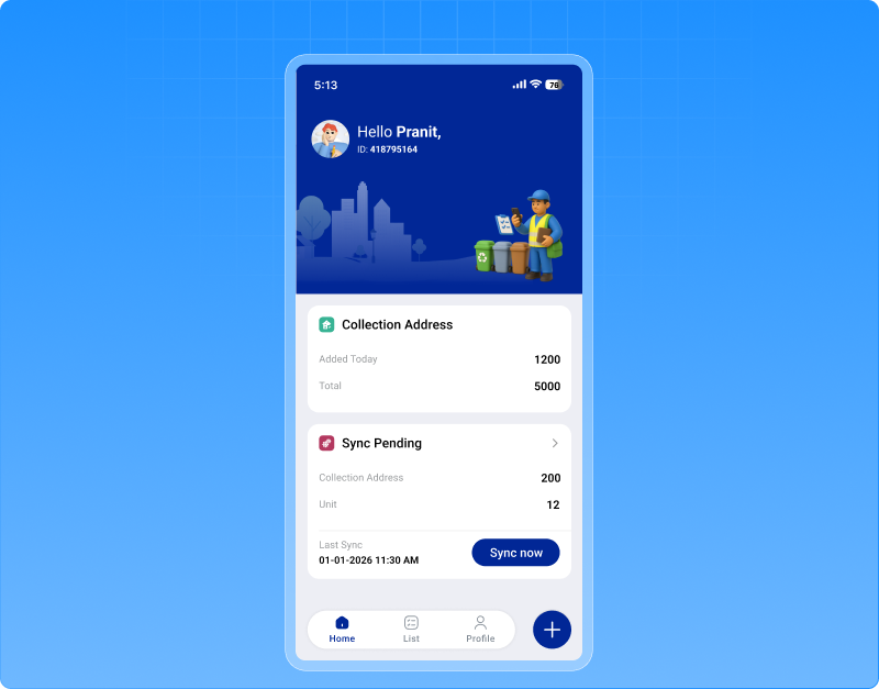
Guided 4-step property survey flow
Property registration is now broken into clear steps:
- Property information – ownership, category, identifiers, bin details
- Photos – property and bin images with GPS capture
- Additional details – bins count, non-working days, preferred time
- Units & submission – unit-level details, photos, multiple bins
Surveyors can move back and forth without losing data, and offline entries sync automatically when internet is available.
How this helps waste operations
- Cleaner and more accurate survey data
- Faster field execution
- Reduced missed or incorrect entries
- Better handling of offline surveys
2.6 Unauthorized vehicle movement alerts in job live tracking
Earlier, if a vehicle assigned to a job started moving before the job officially began, there was no clear way to spot it instantly. This made it difficult for dispatchers to identify unauthorized or premature vehicle movement. We’ve enhanced the Job Tab in Live Tracking to clearly highlight unauthorized vehicle movement for upcoming jobs. This gives dispatchers real-time visibility and better operational control.
Unauthorized movement indicator
How it works
A clear visual indicator appears on a job when:
- The job status is Upcoming
- A vehicle is assigned to the job
- The vehicle is moving while the job has not yet started
The indicator stays visible until the job status changes to In-Progress. Once the job officially starts, the movement is treated as authorised and the indicator disappears automatically. Hovering over the indicator explains the reason clearly, so there’s no confusion.
![]()
Vehicle path view for quick verification
What users can do
- Clicking on the vehicle in the Job Tab shows the vehicle’s movement path for today
- The path is highlighted clearly on the map to grab attention
- The map auto-focuses on the full route so users can quickly review activity
Clicking again hides the path, keeping the map clean.
Flexible view control
The unauthorized movement indicator can be shown or hidden from Job settings, allowing teams to customise their view based on operational needs.
How this helps waste operations
- Immediate detection of unauthorised vehicle usage
- Better discipline and operational compliance
- Faster decision-making for dispatch teams
- Clear visual proof of vehicle movement
3. Gridzee updates
3.1 Inactive object report for better device visibility
In indoor environments, it’s critical to know when a tag or object stops reporting activity. Earlier, identifying inactive or disconnected devices required manual checks and guesswork, making maintenance and troubleshooting slower. We’ve introduced a new Inactive Object Report that clearly shows which objects have stopped sending data, how often it happened, and for how long. This gives teams instant visibility into device health and connectivity issues.
What the inactive object report shows
- Summary view (at a glance)
- Detailed view (expandable)
- Reports can be exported in Excel, PDF, or CSV
- Both summary and detailed views are included
- Exported data matches exactly what is shown on screen
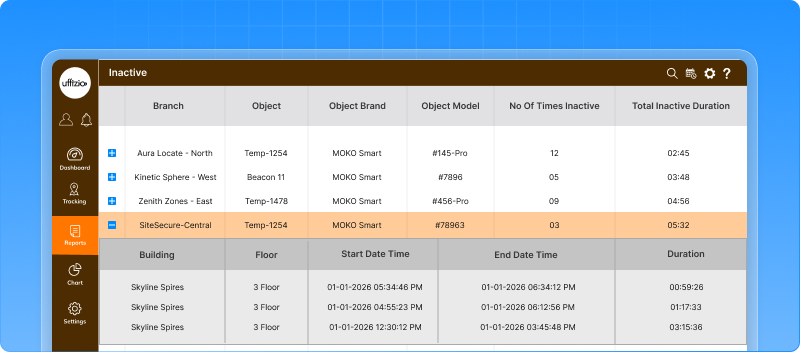
How this helps the business
- Faster detection of inactive or faulty tags
- Reduced downtime through timely action
- Better maintenance planning
- Improved reliability of indoor tracking data
3.2 Advanced floor-level settings in indoor tracking
Earlier, indoor locations could be configured only at a basic level. There was no way to define floor-specific rules like occupancy limits, entry timings, or usage patterns. This limited visibility and control for facilities managing people movement across floors. We’ve enhanced the Location screen with floor-level configuration settings, giving deeper control and better analytics for indoor spaces. These settings become available only after a floor plan is uploaded, keeping the interface clean and relevant.
Floor capacity management
Admins can now:
- Set a maximum occupancy limit for each floor
- Define an alert threshold (for example, when occupancy reaches 80–85%)
This helps prevent overcrowding and supports safety compliance.
Floor entry & exit timings
Admins can define:
- When entry to the floor is allowed
- Until what time exit is permitted
- Applicable days (weekdays, weekends, or custom days)
This ensures controlled access based on operational hours.
![]()
Usage & analytics settings
With analytics enabled, the system can:
- Track real-time occupancy
- Identify peak usage hours
- Monitor movement trends on each floor
These insights help optimise space usage and improve planning.
How this helps the business
- Better control over indoor movement
- Improved safety and capacity compliance
- Clear visibility into floor usage patterns
- Data-driven facility planning
3.3 Zone overstay alerts for indoor safety
In indoor environments, it’s important to know when a person or asset stays too long in a restricted or sensitive area. Earlier, there was no automatic way to detect prolonged presence inside a zone, which could lead to safety, security, or operational issues. We’ve introduced a new Zone Overstay Alert in the Indoor Tracking system. This alert automatically detects when an entity stays in a defined zone longer than allowed and notifies the concerned teams.
Alert notifications
- Zone Overstay alerts can be delivered via: Email, Mobile notification, SMS
- Each alert clearly shows: who stayed longer, which zone was involved, building and floor details, and time exceeded
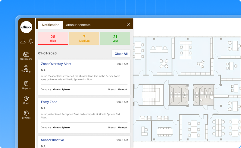
How this helps the business
- Prevents unauthorised or unsafe lingering
- Helps control overcrowding
- Improves security and compliance
- Enables faster response from facility teams
3.4 Smart dashboard widgets for indoor tracking
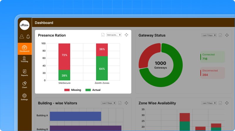
Earlier, indoor tracking data was available, but not presented in a clear, decision-ready way. Facility teams needed a quick view of staff presence, movement, alerts, and violations without digging into multiple screens or reports. We’ve introduced a set of new, interactive dashboard widgets in the Indoor Tracking system. These widgets provide real-time visibility, clear visuals, and drill-down reports to help teams act faster and manage facilities better.
New dashboard widgets added
Presence ratio
This widget shows how many staff are present vs expected, floor by floor.
- Green shows the present staff
- Red shows missing staff
- Automatically adjusts based on the expected staff count set in location settings
- Can be filtered by building to view floor-wise presence
- Clicking the widget opens a detailed list of objects with actual vs expected status
Benefit: Quick attendance and compliance check at a glance.
In/Out flow tracker
This widget shows real-time movement of people within a floor.
It displays:
- Current occupancy
- Number of entries today
- Number of exits today
Users can:
- View data floor-wise
- Set refresh intervals (15 min, 30 min, 1 hour)
- Open a detailed In/Out report with object-level data
Benefit: Better space usage, safety control, and crowd management.
![]()
Alert overview
A single card shows all active alerts across the facility, including:
- SOS
- Restricted access
- Temperature
- Low battery
- Connectivity issues
Clicking the widget opens a detailed alert report with:
- Company, building, floor
- Object details
- Alert type and severity
- Duration and history
- Expandable view for full alert timeline
Benefit: Faster response to critical situations.
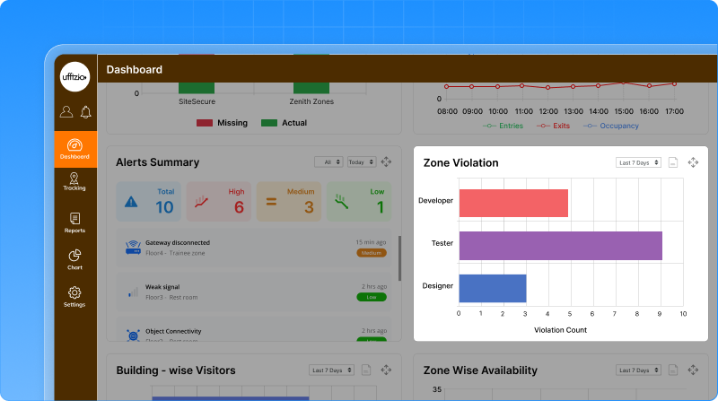
Zone violation
This widget highlights restricted zone violations across buildings and floors.
- Shows which zones are violated most
- Supports building and floor filters
- Helps identify high-risk or sensitive areas
Clicking the widget opens a detailed report showing:
- Building, floor, zone
- Number of violations
- Entry and exit times
- Duration and affected objects
The widget can be enabled or disabled as needed.
Benefit: Improved security and compliance monitoring.
How this help the business
- One-screen visibility of indoor activity
- Faster incident detection and response
- Better safety, security, and space optimisation
- Data-backed facility management decisions
3.5 Point of interest (POI) module for indoor tracking
Earlier, floor maps showed zones but lacked clearly defined points like offices, exits, restrooms, or emergency areas. This made live tracking less intuitive and reduced the ability to manage indoor spaces visually. We’ve introduced a Point of Interest (POI) module that lets users add, manage, and control important locations directly on floor maps—fully integrated with live tracking.
Real-time POI visibility
- POIs appear directly on the live floor map
- Users can enable or disable POIs instantly using a toggle
- Disabled POIs are hidden from the map but remain saved in the system
Zones and POIs together
- Zones and POIs update live on the map
- Any new POI or zone change is reflected immediately
- Helps teams understand movement in relation to key locations
![]()
How this help indoor operations
- Faster navigation and location awareness
- Clear identification of critical areas
- Better emergency and safety readiness
- Improved space and facility management
3.6 Missing object report for indoor asset tracking
In large indoor environments, assets can go missing, inactive, or out of range without immediate notice. Earlier, identifying such assets required manual checks, which increased the risk of loss, downtime, and compliance gaps. We’ve introduced a new Missing Object Report that automatically identifies assets that have stopped reporting their location within a defined time period. This helps teams take quick, informed action using last-known data.
How the missing object report works
- Users define a time threshold (for example, no update in the last 24 hours)
- Any object that does not report location within this time is marked as missing
- Works across different object types such as equipment, personnel, or inventory
- Filter by company, object type, date range, and time threshold
- Export reports in PDF or Excel (summary + detailed views)
- Schedule reports for regular audits and compliance checks
![]()
How this helps the business
- Reduces asset loss and downtime
- Improves maintenance response time
- Provides audit-ready visibility
- Supports proactive facility and security management
3.7 Peak Hour Report for Indoor Tracking
Indoor spaces often face crowding during specific hours, but earlier there was no clear way to identify when and where peak activity happens. This made space planning, safety management, and resource allocation mostly reactive. We’ve introduced a Peak Hour Report that helps identify high-traffic hours on each floor, based on configurable thresholds. This report highlights when activity crosses safe or expected limits, giving teams the insights they need to plan better.
How the Peak Hour Report works
Floor-level configuration
- Each floor can have its own peak threshold (for example, 80 events per hour)
- Any hour crossing this threshold is automatically marked as a Peak Hour
- Filter by company, branch, building, floor, and date
- Export reports in PDF or Excel
- Summary and detailed data included
- Designed to support trend analysis and anomaly detection
![]()
How this helps the business
- Identifies overcrowding patterns
- Improves space and facility planning
- Supports safety and compliance decisions
- Enables data-driven staffing and scheduling
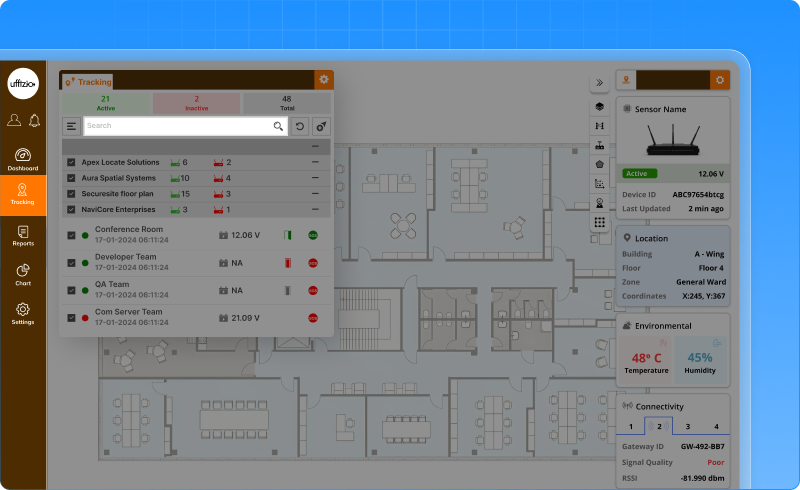
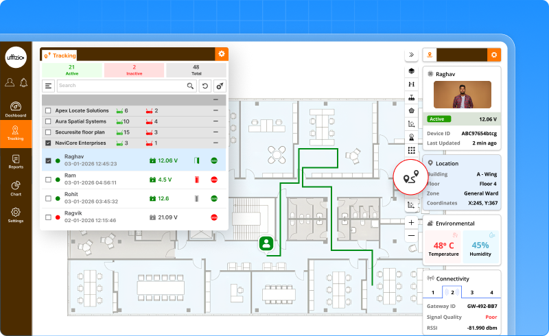
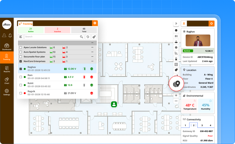
3.8 Smarter & More Powerful Indoor Live Tracking
Earlier, Indoor Live Tracking showed real-time positions, but finding specific tags, managing crowded views, and analysing movement patterns required extra effort. As indoor environments scale, teams need faster search, clearer visuals, and smarter insights—all in one screen. We’ve significantly enhanced the Indoor Live Tracking screen with multiple new capabilities that improve visibility, control, and situational awareness.
Smart Search & Focus
Users can now:
- Search any tag using name, partial name, or ID
- Instantly zoom and focus the map on the selected tag
- Filter objects by type, brand, model, and location
Each tag also shows the current zone name when it is within a zone’s tolerance.
Benefit: Find people or assets instantly without scanning the map.
Clustered Tag View (Clean Map Experience)
When many tags are close together:
- They automatically group into a cluster icon
- The cluster shows the number of tags inside
- Clicking expands the cluster into individual tags
Clustering can be:
- Enabled or disabled from map settings
- Applied zone-wise for better crowd visibility
Benefit: Clear, clutter-free maps even in dense environments.
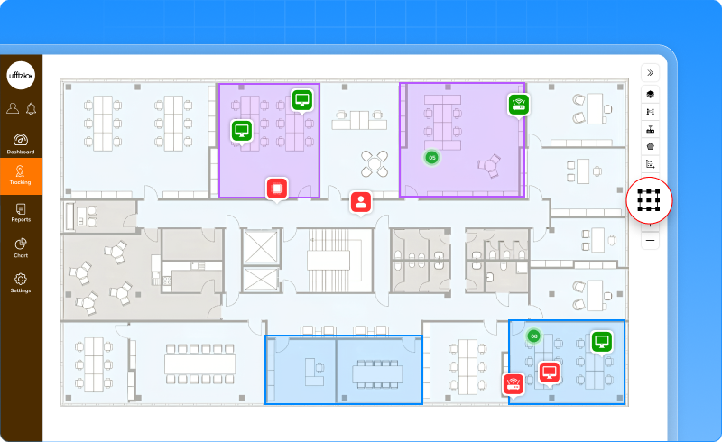
Visual Alert Indicators (Blinking Tags)
Critical situations are now instantly visible:
- Red blinking for SOS or panic alerts
- Orange blinking for inactivity or low battery
Different icons and colours make alert types easy to identify.
Benefit: Faster response to emergencies and device issues.
Movement Trail (Path View)
Users can view a tag’s recent movement path:
- Colour gradient shows recent to older movement
- Duration is configurable
- Trails can be enabled or disabled per tag
Benefit: Understand movement behaviour and patterns visually.
AI-Suggested Zones of Interest
The system now:
- Automatically detects frequent crowd formations
- Highlights potential zones using AI analytics
- Allows users to save or dismiss suggested zones
Risk levels are calculated using crowd density, alerts, inactivity, and movement behaviour.
Benefit: Discover hidden hotspots and plan zones proactively.
One-Click Replay (Instant Playback)
Users can replay past movements with:
- Predefined durations (15 min, 30 min, 1 hour)
- Custom time range selection
- Speed control and pause/play options
Benefit: Quickly review incidents or movement history.
Focus Mode
Focus mode allows users to:
- Lock the view to a single tag
- Or monitor a selected set of tags
Benefit: Avoid distractions during investigations or monitoring.
Object Groups in Live Tracking
Users can now:
- Create object groups
- Filter live tracking by selected groups
- View only relevant objects on map and list
Group filtering updates the map and object list instantly.
Benefit: Better organisation and role-based monitoring.
![]()
How this helps the business
- Faster incident detection and response
- Clearer live view in crowded indoor spaces
- Smarter monitoring with AI assistance
- Reduced operator fatigue