Innovation never stops here. From new modules to performance improvements, we continuously refine the platform to solve real operational challenges. Explore what’s new and see how these updates can add more efficiency to your business.
1. Trakzee Updates
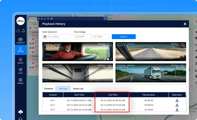
1.1 End time added in playback history
The Playback History list now shows when each file ends. Earlier, only the start time and duration were visible. With this update, the End Time is shown right next to the file duration, making it easier to understand the full playback period at a glance. This End Time will also appear in exported reports. Everything else in the section works the same as before.
1.2 New API introduced for private mode management
Private Mode has always been a helpful feature — a way to turn off tracking for a vehicle whenever needed. But until now, everything had to be added or managed manually from the screen.
So we decided to make this smoother.
A new Private Mode API is now available.
Think of it as a direct line that lets systems create, edit, view, or delete Private Mode entries without opening the app.
Here’s the simple idea behind it:
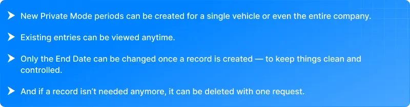
- New Private Mode periods can be created for a single vehicle or even the entire company.
- Existing entries can be viewed anytime.
- Only the End Date can be changed once a record is created – to keep things clean and controlled.
- And if a record isn’t needed anymore, it can be deleted with one request.
The API follows the same rules as the web screen – no overlapping dates, proper start–end times, and clear validation.
Once a Private Mode period is active, tracking will pause automatically and resume again as soon as the time ends.
In short, Private Mode is now fully manageable through API… making integrations easier, setups faster, and operations more flexible.
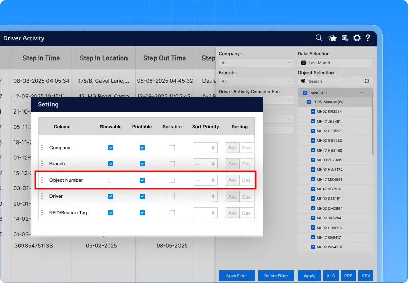
1.3 Vehicle numbers added in driver activity report export
There was always one small gap in the Driver Activity Report.
On the screen, the summary couldn’t show vehicle numbers because a driver might handle more than one vehicle — and displaying all of them together didn’t really fit the format.
But clients still needed that information, especially when exporting the report.
So now, the exported Driver Activity Report (Excel/CSV) will include a new column called “Object Number.”
In this column, every vehicle linked to a driver will be listed.
And if a driver has handled multiple vehicles, all the vehicle numbers will appear neatly in a comma-separated list.
The screen view remains the same – nothing changes there.
This update is only for exported files, so users get complete and clear data without affecting the UI.
Simple, clean, and finally complete.
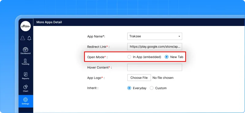
1.4 More control over how “More Apps” links open
The “More Apps” section has always been a handy place to add extra tools and integrations.
But one thing was missing—there was no control over how these links open. Some apps are better inside the platform, while others work best in a separate browser tab.
So we’ve made this flexible.
A new option is now available while setting up any app inside More Apps. The person configuring the app can simply choose whether the link should:
- open inside the app, or
- open in a new browser tab.
It’s a quick radio-button choice added just below the Redirect Link field.
If “In App” is selected, the link will open inside the platform with its own header and a Back/Close option. And if the website doesn’t support embedding, the system will automatically switch to a new tab and show a small message—so nothing breaks.
There’s also an extra checkbox that appears only when “In App” is selected. If enabled, it helps generate a special URL format for specific integrations that need tokens or customer codes.
Access to these app settings continues to be rights-based, so only permitted admins or resellers can change them.
Overall, this update makes third-party links behave exactly the way teams want—smooth, controlled, and predictable.
1.5 Clear view of multiple events on the same location
During playback, events sometimes happen at the exact same spot on the map.
But earlier, when several events shared the same LAT-LONG, they got placed on top of each other. Only the top marker was visible, while the rest stayed hidden – almost like they never happened.
Now that’s fixed.
Whenever multiple events occur at the same location, the map will show a small stack of circles instead of a single marker. This stack is a visual hint that there’s more happening at that point.
- Hovering over the stack can show something like “3 Events.”
- Clicking the stack will open a neat popup listing all those events together.
- Each event in the popup can be selected and viewed without losing track of the playback.
The popup closes automatically when clicking outside, and it won’t cover or interrupt playback controls.
Even if 10+ events appear at the same spot, every single one will be visible — nothing gets lost now.
So playback becomes clearer, cleaner, and far more reliable.
![]()
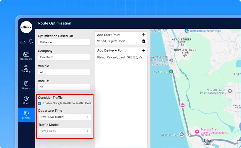
1.6 Smarter route optimization with live traffic
Until now, the Route Optimization feature worked purely on distance.
It found the shortest path, but not always the fastest one – especially during heavy traffic. So a route that looked perfect on paper sometimes turned into a long, slow journey on the road.
That changes now.
Route Optimization can now consider live traffic when Google Maps is selected as the map provider.
With this enhancement, the system doesn’t just look at how far a route is – it looks at how long it will actually take.
Here’s what’s new:
- A new “Consider Traffic” option appears when using Google Maps.
- Users can choose to optimize the route for right now or for a scheduled time in the future.
- An additional dropdown lets users pick a traffic model like best guess, optimistic, or pessimistic – based on how they prefer the ETA to be calculated.
Once traffic-based optimization is enabled, Google’s Directions API steps in and rearranges the route using real-time traffic data.
Waypoints are reordered automatically, and the final route reflects the shortest travel time, not just the shortest distance.
The result?
Smarter planning, fewer delays, better fuel usage, and smoother operations – especially during peak hours.
This traffic option only appears when Google Maps is selected, keeping the experience clean and relevant.
1.7 New ‘Fuel Overconsumption’ column added to fill drain report
Fuel usage tells an important story, but until now, the Fill Drain Report only showed how much fuel was filled or drained — not whether a vehicle was actually using more fuel than it should.
So a key insight was missing.
To fix this, a new “Fuel Overconsumption” column has been added to the summary view of the Fill Drain Report on both web and mobile.
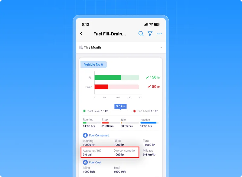
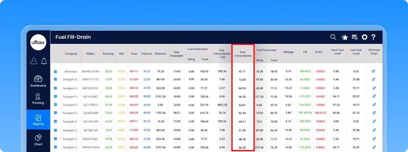
This new column appears right after Avg Consumption / 100 and highlights how much extra fuel a vehicle has consumed compared to its expected or standard usage.
The value is shown in litres, just like the rest of the report.
This makes it much easier to spot vehicles that are burning more fuel than they should – helping teams catch issues early, improve efficiency, and control costs.
The column also carries over to exported reports like Excel and PDF, and it doesn’t affect the detailed drill-down view. Everything loads just as smoothly as before, only now with a little more clarity.
1.8 Depth sensor integration added across web & mobile
Many operations rely on knowing the exact depth of tanks, containers, or equipment. Until now, this information lived outside the GPS application — which meant extra tools, extra checks, and extra effort.
So we’re bringing depth data into the GPS platform, right where everything else already lives.
With this update, the system now supports full Depth Sensor integration across Web and Mobile.
Here’s what this means in everyday use:
![]()
Live Depth at a Glance
A new Depth widget now appears inside the object tooltip on Live Tracking.
It shows:
- the latest depth reading,
- the last updated time,
- and even the day’s min, max, and average values.
The widget updates in real time, and on Web, it also links to a quick 24-hour depth graph.
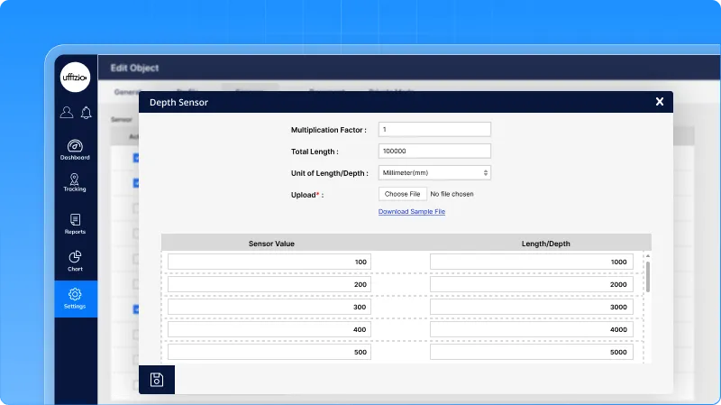
Simple Sensor Setup & Calibration
A new Depth Sensor (Analog) option is now available under the sensor mapping screen.
Admins can map the sensor to any vehicle and set calibration values like:
- multiplication factor,
- total length,
- and units (mm).
Everything is configured in the same familiar place where existing sensors are managed.
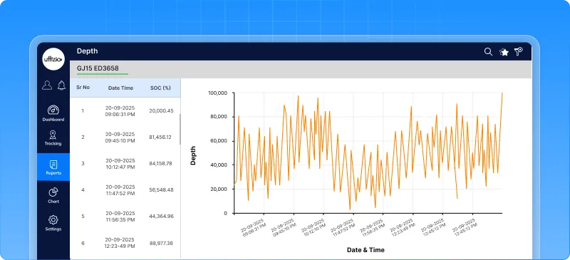
Depth Analytics – Clear Trends Over Time
A new chart has been added under Chart → Depth.
It shows how depth changes over a selected time period, using a clean line or bar graph.
Hovering reveals exact values and timestamps, and the chart can be exported as a PDF.
Two New Depth Reports
To make depth data easy to audit and analyze, two new reports are now available:
- Depth Summary Report
Shows high-level depth information along with essential trip and vehicle details. Includes summary + detail view, playback links, and full export support.
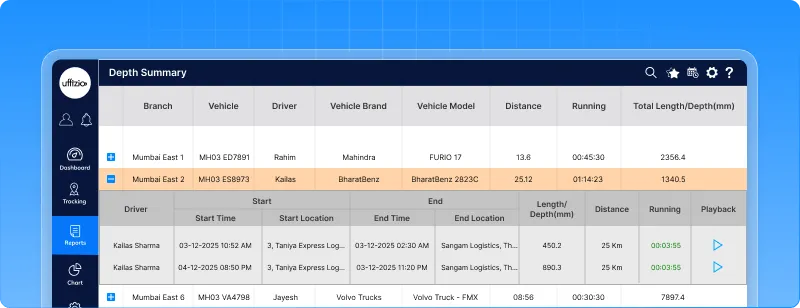
- Depth Status Report
Shows the latest depth readings object-wise, along with IGN, GPS, speed, address, and last updated time.
Exports include coordinates instead of the map. Scheduled reports are supported for both.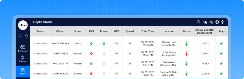
This integration brings depth monitoring, analysis, and reporting into one place – making it easier to track usage patterns, detect irregularities, and make smarter operational decisions without switching tools.
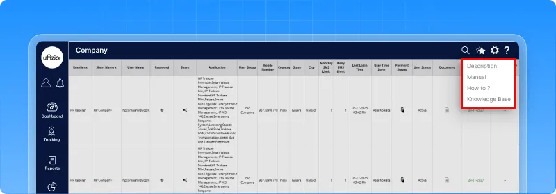
1.9 Screen help is now admin-specific
Screen Help has always been a useful guide for users—showing descriptions, links, and documents for each screen.
But until now, all help content was controlled centrally. That meant every Admin, every project, and every user saw the same help text… even when their workflows were completely different.
So we’ve redesigned how Screen Help works.
With this enhancement, each Admin can now manage their own Screen Help, tailored to their own applications, screens, and languages.
What’s new?
- A new Admin field has been added inside Settings → System → Screen Help.
- Admins can now enter their own descriptions, media, and help links for the screens they manage.
- A special “Knowledge Base Link” field has been added to attach relevant documentation.
- If Admin-specific help exists, it’s shown to the user.
- If not, the system automatically falls back to the default/global help.
This update creates a more flexible, meaningful help experience where each project or customer can have guidance that actually matches their setup — without affecting anyone else.
Simple, organised, and much easier to maintain.
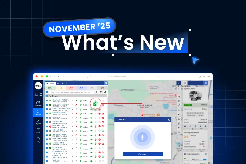
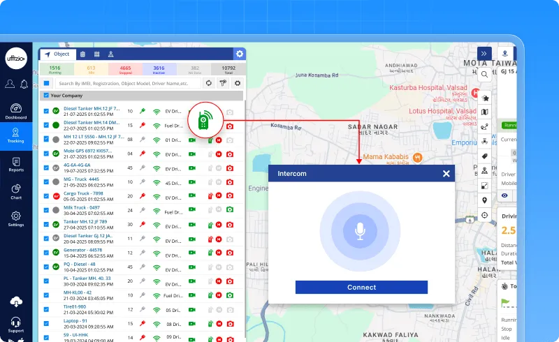
1.10 New intercom feature for real-time voice communication
Sometimes typing isn’t enough, and calling a driver through a separate phone becomes slow and inconvenient.
To make communication faster and more direct, a brand-new Intercom feature has been added right inside the Object List.
This lets users speak to the device and listen to live audio instantly — without leaving Live Tracking, without switching apps.
How it works
A small Intercom button now appears next to each object in Live Tracking.
The button color tells the availability:
- 🟢 Green – Device supports Intercom and is online
- 🔴 Red – Device is offline
- ⚪ Grey – Device does not support Intercom
Clicking the green button opens a clean dialog with two options:
- Connect – starts the live audio stream
- Close – ends the session
Audio flows both ways: users can speak directly to the device, and also listen to what’s happening around it.
The same Intercom option is available inside the Camera widget and can be enabled/disabled from List Settings.
On Mobile, it appears under Object Tooltip → Activity → Intercom.
This enhancement is especially useful for teams that need quick voice access — logistics, waste management, transport, emergency response, and more.
Instant communication, right where it’s needed.
1.11 Passwords are now completely hidden across the system
Passwords are one of the most sensitive parts of any system, and showing them anywhere – even by mistake – can lead to serious security risks.
So this enhancement focuses on one big goal: no password should ever be visible, anywhere.
To achieve this, every place in the application where a password could previously appear has been redesigned.
What’s changed?
- All password columns have been removed from every user list – Admins, Resellers, Companies, Sub-users, everyone.
- On forms, password fields now behave like proper secured fields. They never show the old password, not even as a masked value.
- When editing a user, the password box stays empty. Only a new password can be entered – the old one is never revealed.
- Passwords are no longer passed in UI elements, hidden fields, or API responses.
- Exports like CSV or Excel no longer include any password column.
- Logs and audit trails continue to record actions, but never the password itself.
Even support tools now follow the same rule:
No one – not admins, not support, not internal users – can see or retrieve any stored password.
This update ensures the application meets pentest and security compliance requirements and keeps all user credentials completely protected.
A quieter change, but an important one – strengthening the foundation of security across the entire platform.
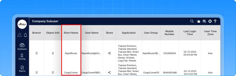
1.12 New ‘Short Name’ field added for faster sub-user search
Searching for sub-users using only their email address could get a bit tiring — especially when emails are long or not easy to remember.
So to make things smoother, a new Short Name field has been added to the Company Sub-user section.
What’s updated?
- Every sub-user now has a Short Name — a quick, easy label that can be searched just like email.
- This new field shows up on both the overview and detail screens.
- If no short name exists, the system will show “NA” or “– – ” so the screen stays clean and consistent.
Admins can update the Short Name anytime, just like any other sub-user detail.
Behind the scenes
- All existing sub-users will automatically get their username set as their Short Name during migration.
- Sorting and searching now work with Short Name as well.
- XLS exports also include this new column, so nothing gets missed outside the app.
A small change — but it makes finding users quicker, cleaner, and a lot more user-friendly.
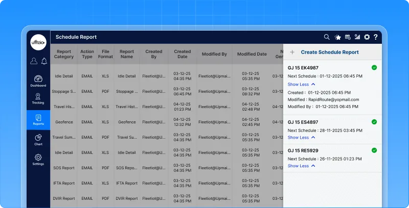
1.13 Audit details added to the schedule report & configuration screens
Schedules are powerful, but without knowing who created or changed them – and when – it becomes hard to track updates or maintain accountability.
So this enhancement brings complete clarity to scheduled reports.
What’s new?
Both the schedule report screen and the schedule report configuration screen now show three important audit fields:
- Created date – when the schedule was first set up
- Modified date – the last time it was changed
- Modified by – the user who made the latest update
These fields appear right beside the existing “Created By” details, making everything easy to read in one glance.
Consistent visibility everywhere
So whether someone is checking the report on-screen or offline, the history stays clear and accessible.
The system updates these fields automatically each time a schedule is modified, and everything follows the standard date–time format used across the application.
A small but meaningful enhancement – bringing more transparency, easier tracking, and better confidence in scheduled operations.
2. SmartWaste Updates
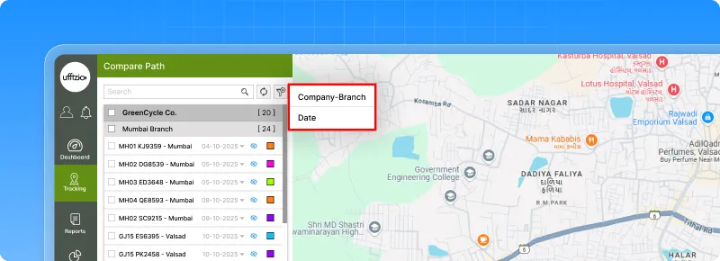
2.1 Compare path view with smart filters
A new Compare Path screen has been added in the Job Tab to help supervisors see all vehicle routes for a job on one map. It shows each vehicle’s path with direction arrows, labels, and zone/ward fences for quick visual checks.
An organised list on the left groups vehicles by Town → Zone → Ward, where users can show/hide paths and pick colors for easy comparison.
Now with Filters
A new Filter button lets users narrow the object list by:
- Company
- Branch
- Date
Once selected, the list refreshes to show only relevant vehicles.
This update makes route comparison simpler, cleaner, and much easier to manage during SmartWaste operations.
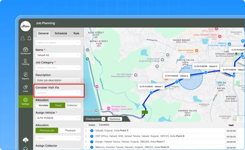
2.2 RFID added to ‘Default’ visit validation
The Consider Visit Via setting in the Job screen has been improved to make visit validation more flexible and reliable.
Earlier, the Default option only checked visits through QR Code or Map.
Now, RFID has also been added to this logic.
What this means
When a job uses Default, a checkpoint will be marked as visited if validation comes from:
- QR Code
- Map (location)
- RFID
And if multiple validations happen, the system will use the latest source received.
For jobs specifically set to “RFID,” both the vehicle and RFID scans can be used to validate start and end points.
No changes are made to other visit modes – QR-only, RFID-only, Bins & Skips, or Mechanical Sweeping work exactly as before.
A small update that makes visit tracking more complete and avoids missed validations.
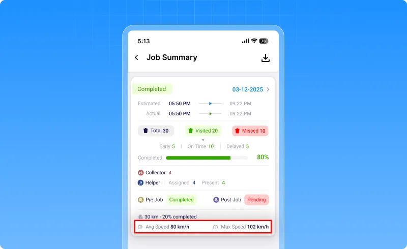
2.3 Average & maximum speed added to job detail summary
To give better insight into how efficiently each job is carried out, two new speed metrics have been added to the Job Detail Summary report.
These help identify delays, track vehicle performance, and ensure compliance with speed rules during collection routes.
What’s updated
For every completed job, the report now shows:
- Maximum Speed (km/h) – the highest speed recorded between the first and last collection address
- Average Speed (km/h) – calculated using total distance and total time for the same stretch
If GPS data is missing or incomplete, the report will simply show N/A.
Where it appears
- Web report
- Mobile report
- Excel & PDF exports
The new values appear right after the existing distance-related fields, without affecting report performance.
A small addition – but a powerful one for analysing route behaviour and on-ground efficiency.
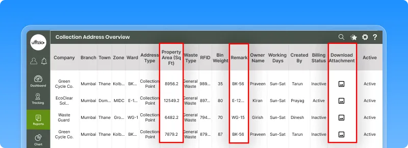
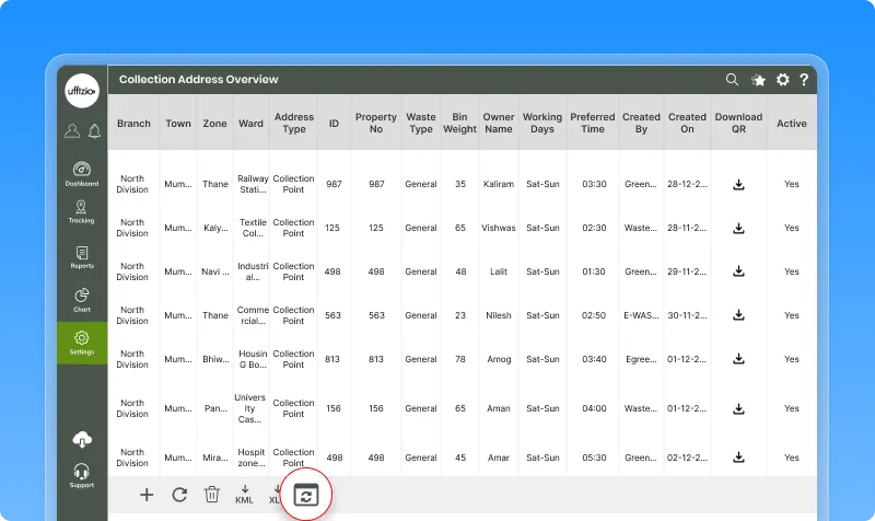
2.4 Property area, remarks & images added to collection addresses
To make collection details more complete and useful, the Collection Address section now includes a few extra fields that help capture on-ground information more accurately.
Three fields have been added:
- Property Area (Sq Ft)
A numeric field to record the size of the property being serviced.
Shown on the overview screen and also included in bulk uploads. - Remark
A text field for additional notes.
Already supported by the Surveyor App and now visible/managed on Web as well. - Attachments
Image upload support (up to 2 files).
This too was already coming from the app and is now reflected on the Web overview.
Bulk Upload
The bulk upload template now includes:
- Property Area
- Remark
- Attachments
Invalid entries are flagged with clear error messages.
Live Tracking Widget
The same details – Property Area and Remark – now appear in the live tracking widget under the collection address, giving quick clarity during operations.
A simple update that makes every collection address richer, clearer, and more informative.
![]()
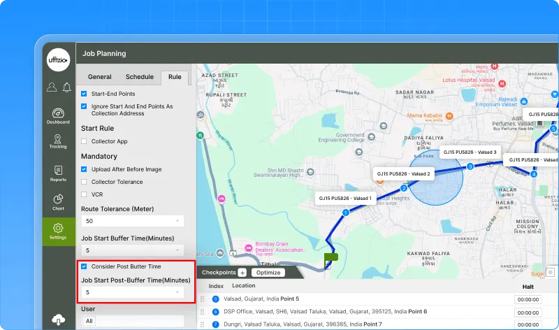
2.5 New post-buffer rule for late job start handling
To make job start tracking stricter and more reliable, the Job Planning module now includes a second buffer that checks whether a job actually begins on time.
A new field has been added under Settings → Master → Job → Rule tab:
Job start post-buffer time (minutes)
This defines how long after the Estimated Start Time a job is allowed to remain “Upcoming.”
If the job still hasn’t moved into “In-progress” within this window, it will now be automatically marked as Failed.
How the new timing works
A job must start within this full window:
[ Est Start Time – pre-buffer ] → [ Est Start Time + post-buffer ]
If the job does not start by the end of this window and is still “Upcoming,” the system will auto-fail it.
Jobs manually force-started or manually updated won’t be affected.
What this improves
- Clearer control over job start timing
- Automatic handling of jobs that never begin
- Better data accuracy for supervisors
- Full audit logging with the reason:
“Auto-failed: Job start time exceeded post-buffer limit”
Existing jobs remain unaffected unless configured.
A simple addition that brings tighter monitoring and smoother job management.
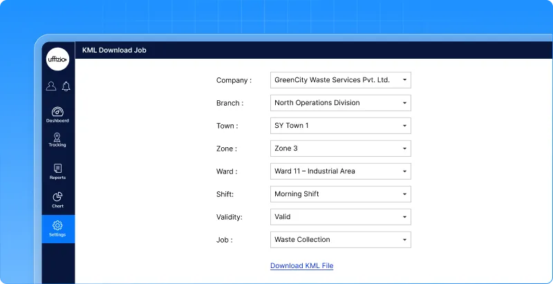
2.6 New “Download KML” option in job overview
To make route data easier to share and analyse outside the system, a KML download feature has been added to the Job Overview screen.
This lets users export any job’s configured route and open it directly in tools like Google Earth or other GIS applications.
A KML button now appears beside the existing XLS download options.
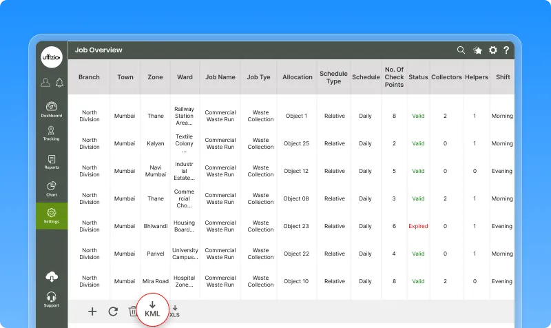
When clicked:
- A small popup opens.
- The user selects a job from the dropdown list.
- Hitting Download generates a KML file containing that job’s route.
- The file is saved using the job’s name.
If a job has no route data, an appropriate message appears.
Why it helps
This makes it easy to:
- visualise job routes on external mapping tools
- share routes with field teams or partners
- perform custom analysis outside the platform
Simple, fast, and fully aligned with existing permissions and UI flow.
2.7 Bulk update added for collection addresses
Managing collection addresses one by one can get slow, especially when large areas or multiple wards need updates.
To make this process faster and cleaner, a new Bulk Update option has been added to the Collection Address module.
Clicking it opens a dedicated screen where users can select:
- Company
- Branch
- Town
- Zone
- Ward
After choosing the filters, two actions are available:
- Bulk Upload → upload an Excel file to update or add collection address details
- Download Sample File → download a ready-made Excel template with the correct fields
The system validates the uploaded file, shows a clear summary of errors (if any), and updates the records only after everything checks out.
What this improves
- Faster updates for large datasets
- No manual entry for repetitive changes
- Clean error reporting before saving
- Fully controlled access – only authorized users can use this screen
- Secure logging for every upload action
Simple, smooth, and efficient – perfect for handling high-volume collection address updates.
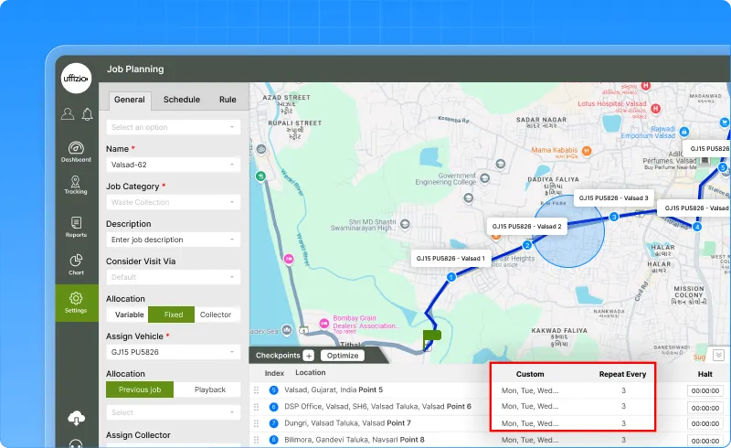
2.8 Flexible collection frequency for daily relative jobs
Daily Relative jobs can now be more flexible.
Each collection address no longer has to follow a strict daily schedule. A new Preferred Collection option lets every address choose its own pattern:
- Daily (default)
- Custom Days (pick weekdays like Mon–Wed–Fri)
- Repeat Every X Days (e.g., every 3 days)
These settings decide when the address appears as Planned in jobs.
The feature is available in:
- Job Creation
- Collection Address autofill
- XLS upload (with new fields)
- Job configuration list
This makes job planning more accurate and avoids unnecessary daily routes.